ANE Association of Nordic Engineers
Designing for the smartest people on Earth
ANE is an association of 500K+ Nordic engineers and has a prominent position as a thought leader by sharing well-researched insights, expert opinions, and informed perspectives on engineering-related matters. ANE is a go-to source for policymakers, media, and professionals seeking reliable information and as such must be presented accordingly.
We helped channel their ambitions visually and gave their strategic starting point new life through an updated identity and graphic tool box.
Deliverables
Research and Insights
Brand Identity
Design Guidelines
Content production
Campaign
A logo in motion
By taking their existing logo and letting it be the foundation for a graphic design language that points towards the future and with its organic wave-like shape at the same time exudes Nordic power and drive. We call it “The ANE wave”.

Good riddance to boring.
A colour pallette you can’t ignore
We broke with classic conservative colours and were inspired by the way ANE is a spokesperson for the most innovative people in the Nordic region. They want to be heard and they want to make a difference.

Web design
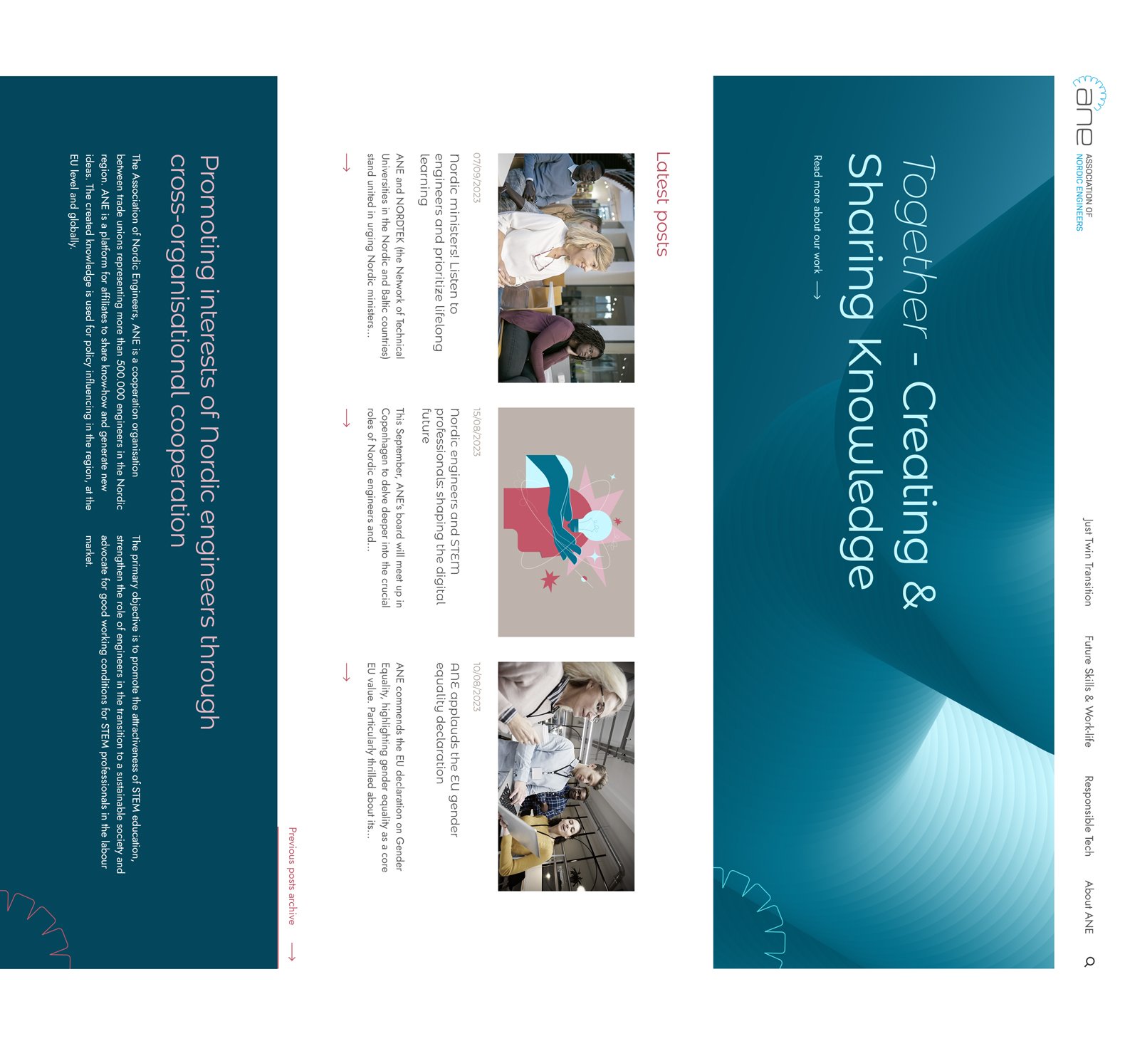
Updating, without re-inventing
By updating the stylesheet and images, a whole new energy was created on the website, aiming to cater to a variety of different target audiences.
SoMe Campaign
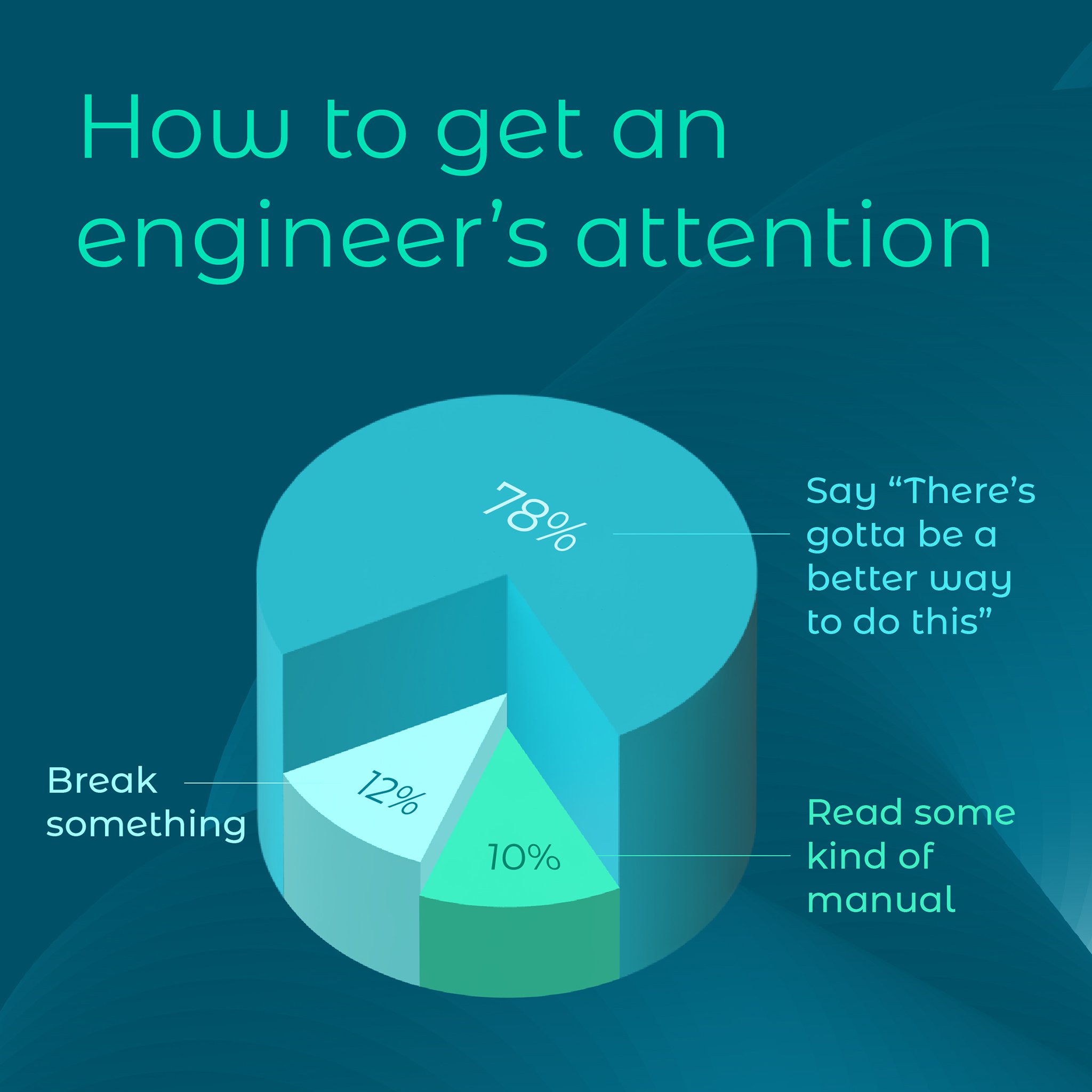
How do you make an engineer smile?
We asked ourselves this before we were tasked with developing a social media campaign to stage World Engineer Day in an unconventional way. We decided to try and capture the same tone as when engineers playfully joke with each other. It turned into a series of memes that combined dry humor with ANE's modern identity.


Making room for bold statements
By using the new, graphic ANE wave as both a background and a cut-out graphic, we gave the logo a prominent place in ANE's identity and at the same time we had a colour basis for big statements in large lettering

