
Capturing a wastewater story
BIOFOS
Water, nature, people.
BIOFOS is Denmark's largest wastewater company. They utilise the resources in wastewater for climate-friendly energy in the form of electricity, biogas, and district heating for the supply network.
BIOFOS
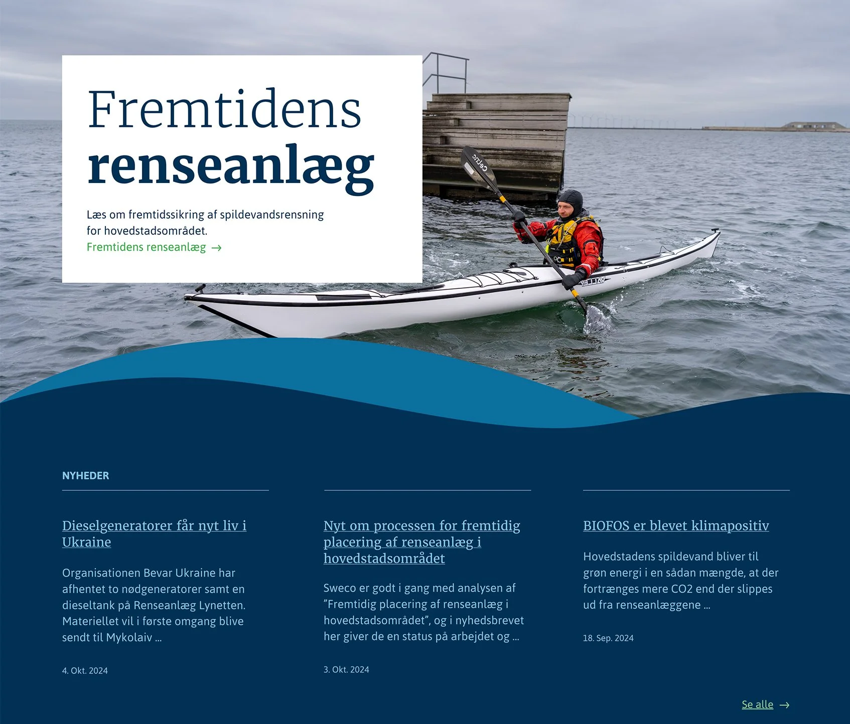
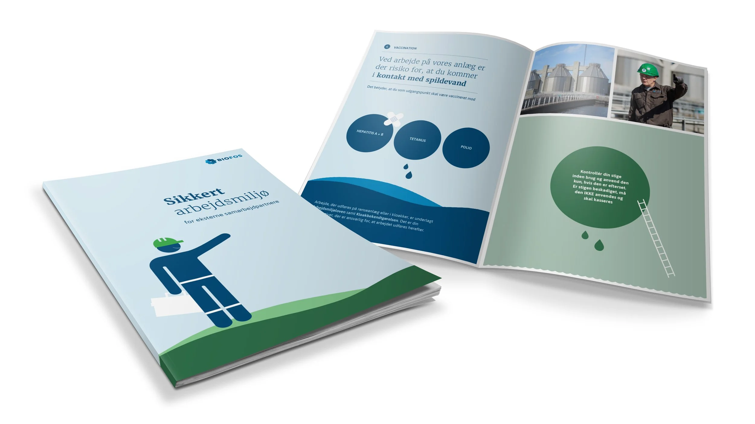
Our task was, drawing on previous design documents, to develop a new, robust brand guide and tool box for BIOFOS. We developed a more organic visual universe, with a vibrant, graphic palette of everything that the brand encompasses and processes: water and nature and people.
We developed a new "fifth element"; a soft wave that can frame BIOFOS’s messages and content, and symbolise both land and water.
A new wave
Rules to live by
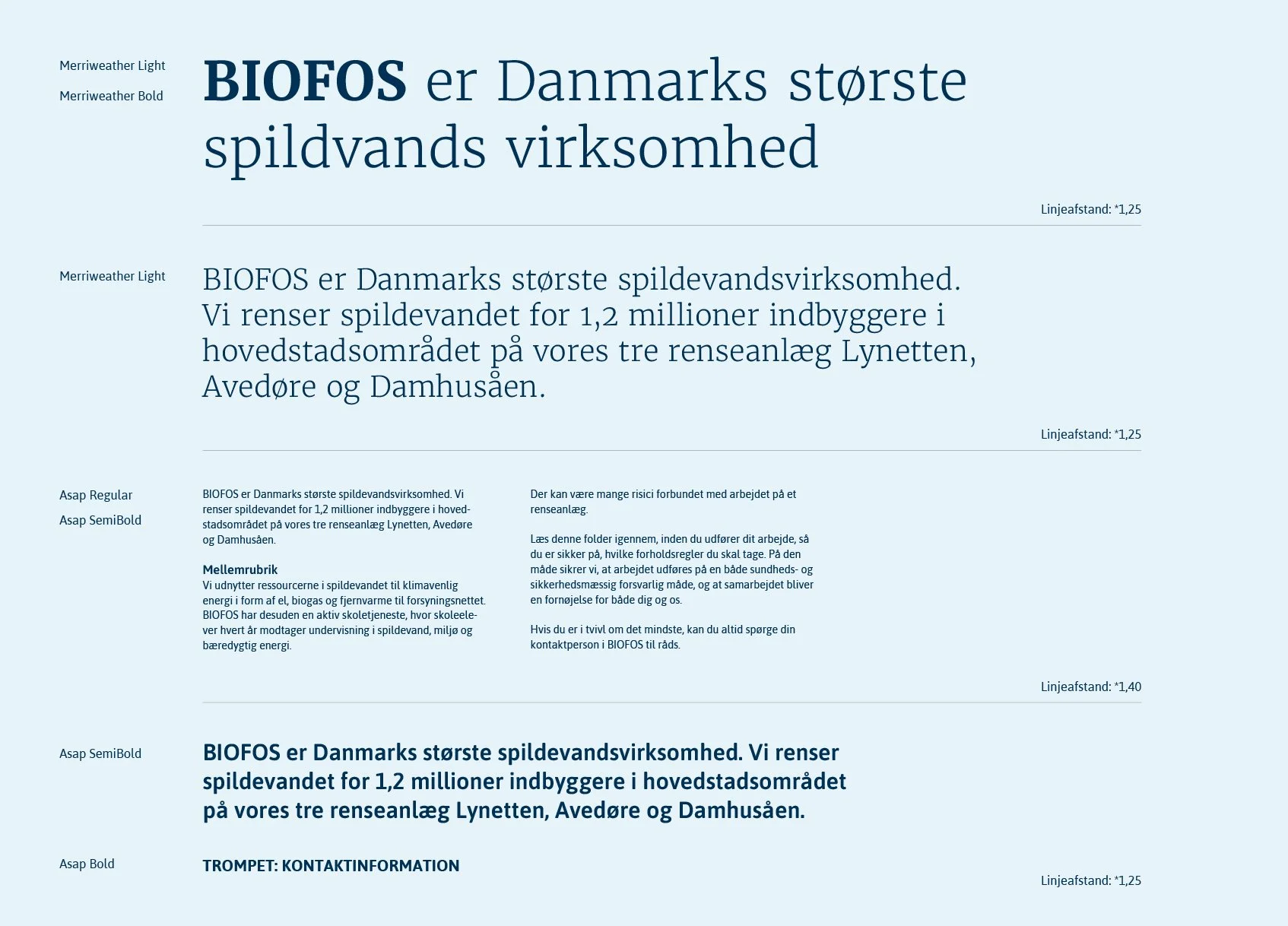
We sharpened the colour palette for easier use and greater brand consistency. A font hierarchy was developed with simple rules for its application, and a range of visual examples were created to demonstrate how we ensure uniformity across platforms and media.


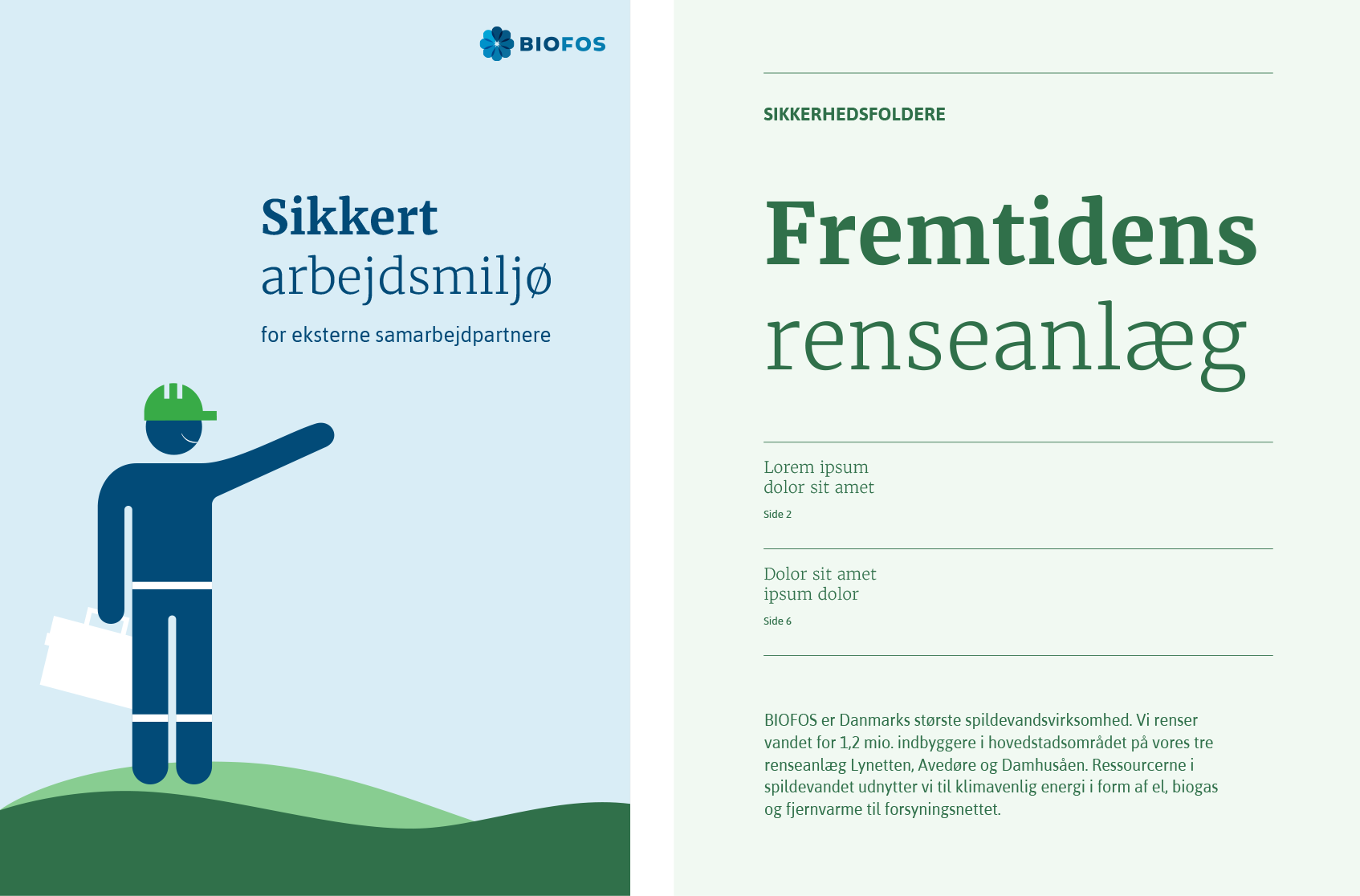
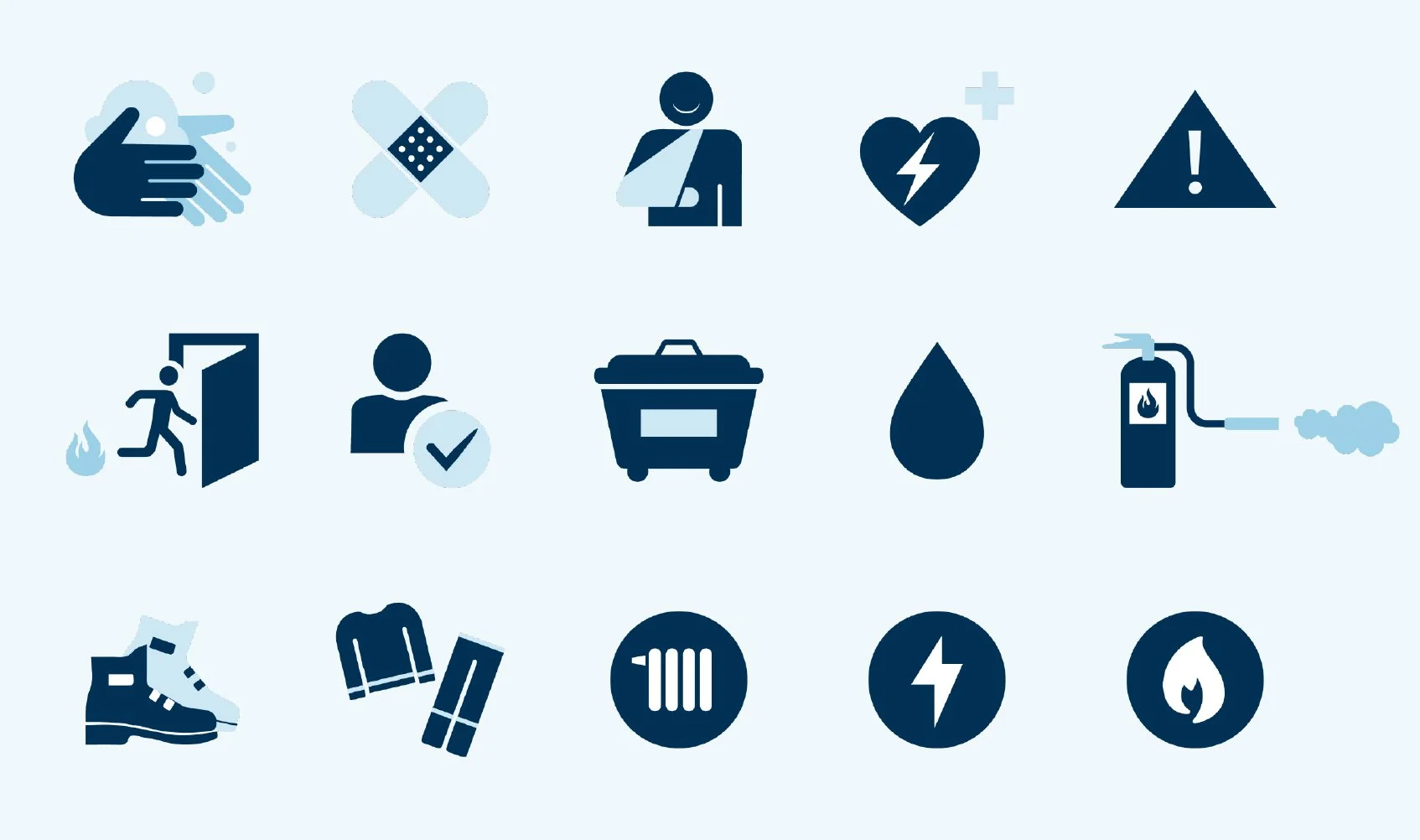
As a supplement to the graphic design system, we created a library of icons that can be used as both illustrations and navigation.

“Ruby&Red quickly understood our corporate strategy and transformed it very well into an easily understood and recognisable brand- and design guide. In the process Ruby&Red constructively challenged our perspective and thus ensured a better product in the end. Ruby&Red are easy to work with, respect deadlines and goes a long way to accommodate customer wishes.”
- Bjørk Hasager Sørensen, Biofos