
Two Legacies. One Future.
Merging two academies in one strong, future-oriented brand capable of attracting tomorrow's students.
OUR TASK
In summer of 2025 there was a fusion of two academic giants: Copenhagen Business Academy and KEA (Københavns Erhvervsakademi) became Erhvervsakademiet København (Business academy Copenhagen).
Our task was to navigate the complex landscape of unifying two distinct organisations, brand identities, and cultural heritages. We developed a completely new identity that honours the past while looking to the future.
Redefining academic tone
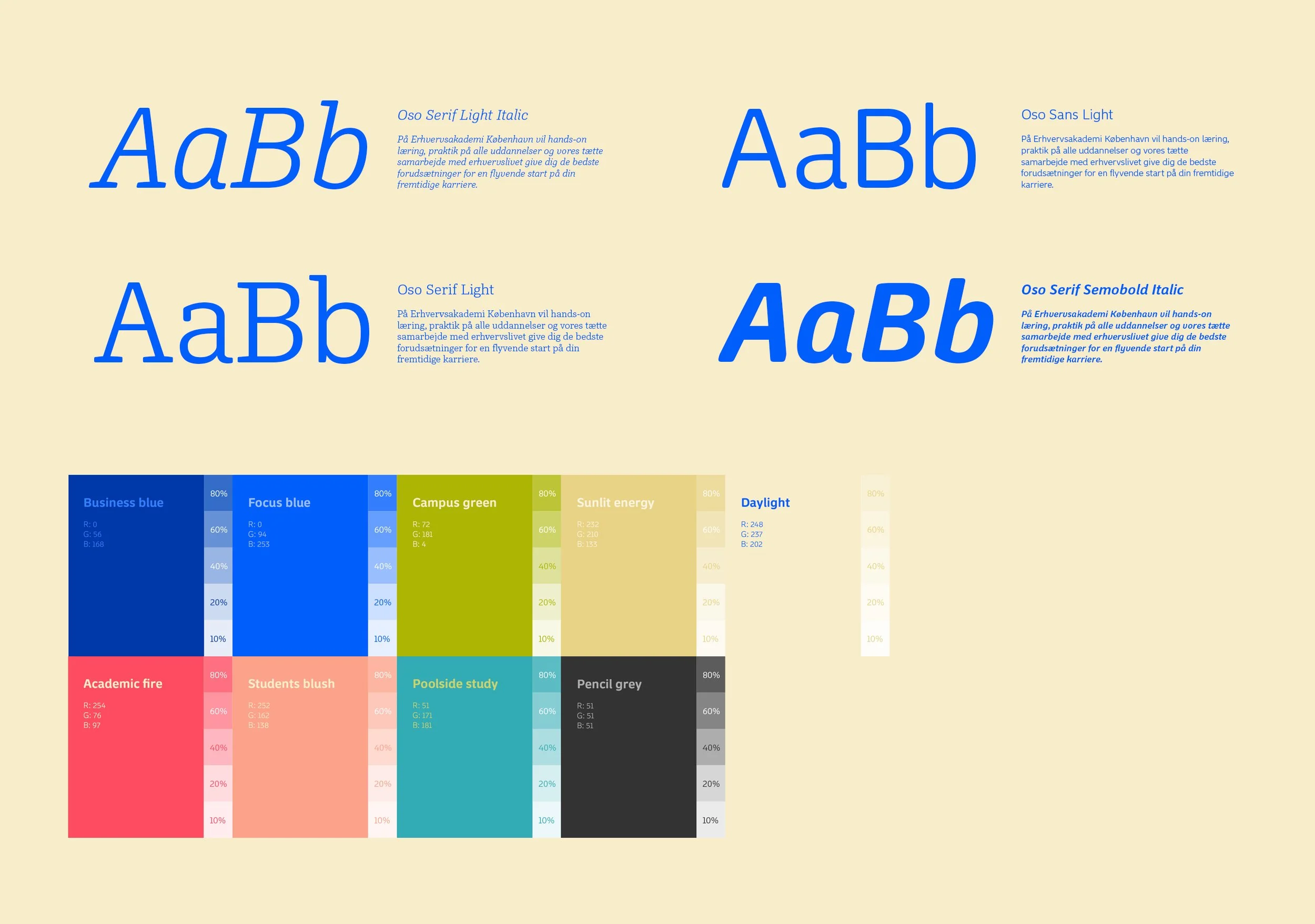
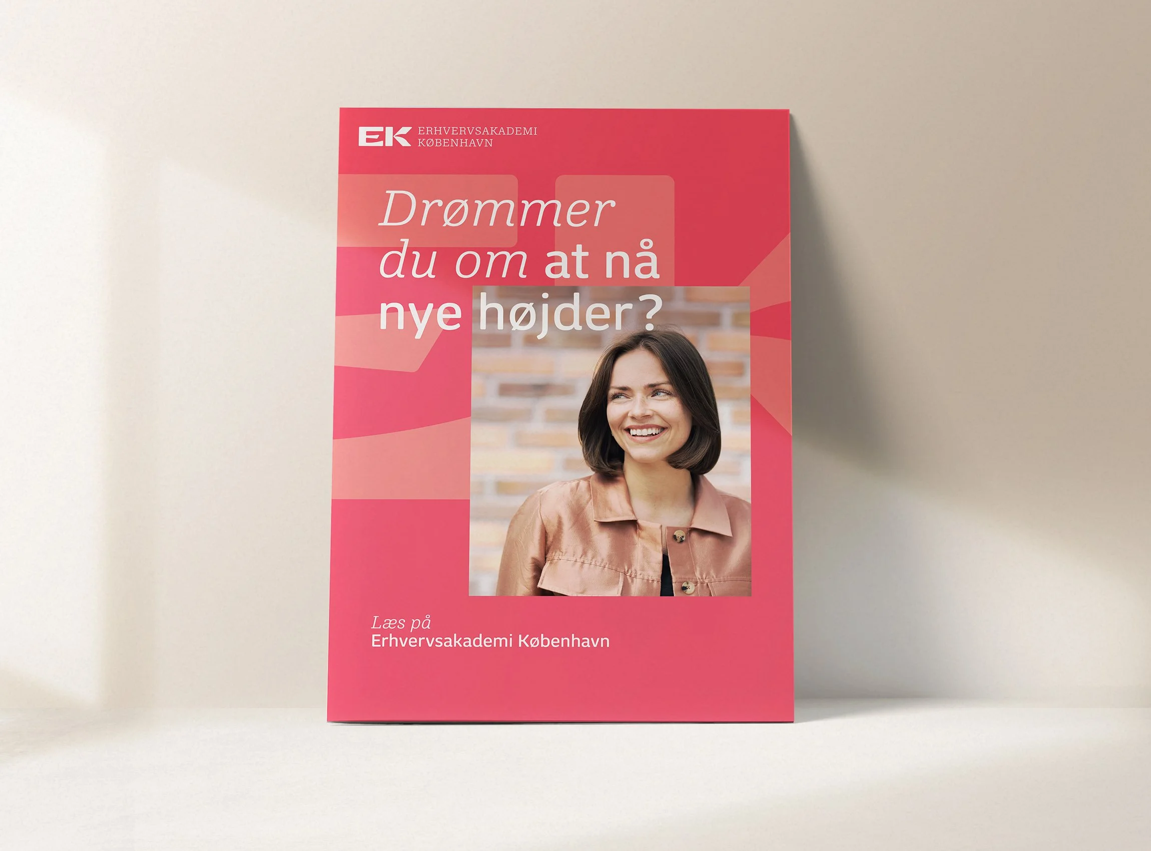
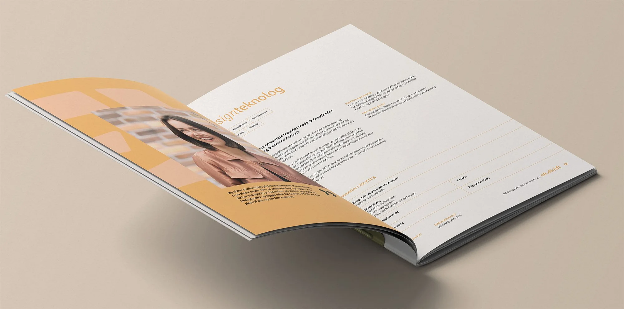
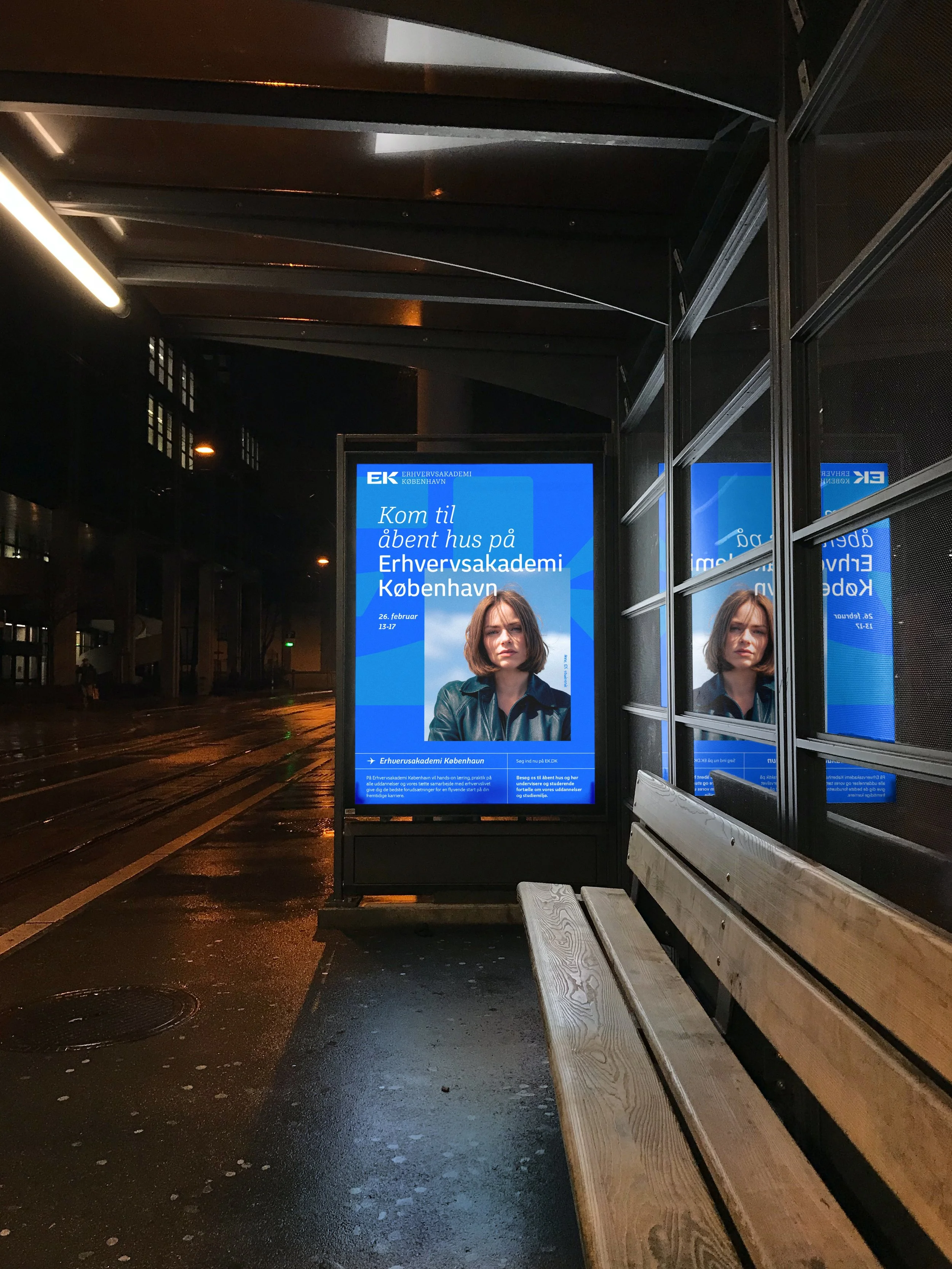
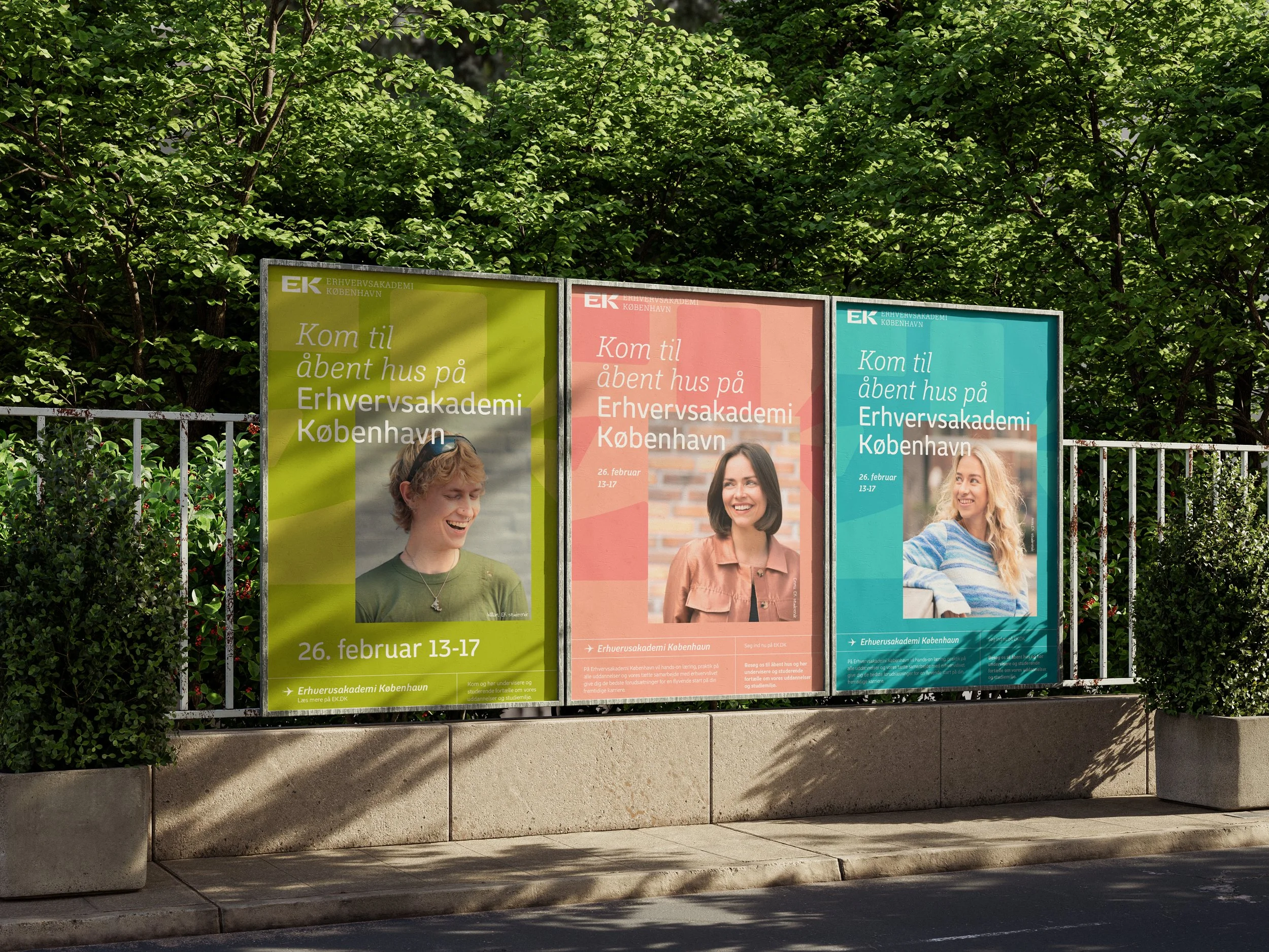
To stand out in a traditional academic landscape, which is often characterised by classic, conservative colours, we opted for a bold colour palette. This strategic decision allowed us to give the brand a fresh, creative energy and make it pop.
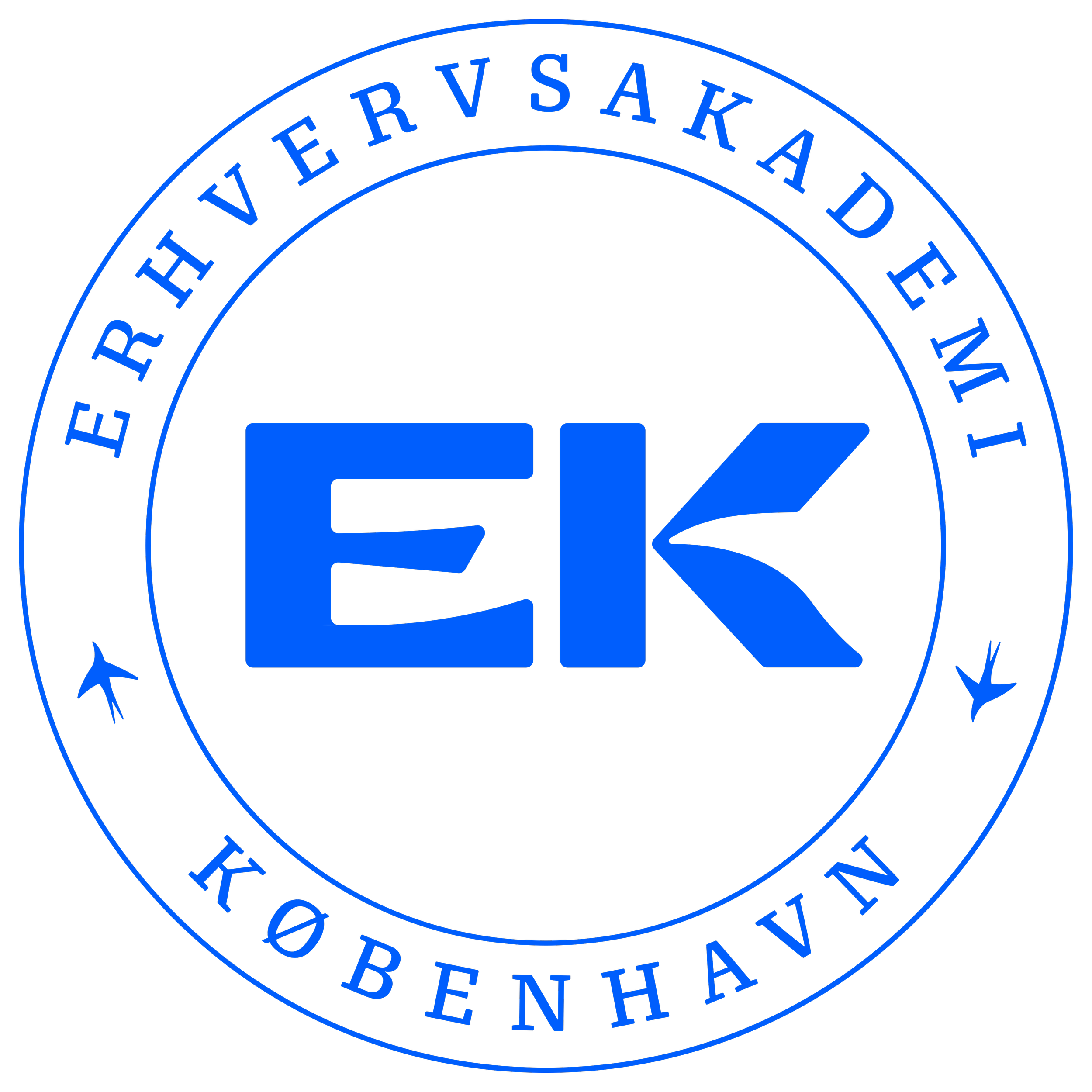
The logo bird
When we approached EK’s existing logo, a swallow emerged before our eyes and we had to free it and let it fly across the website as a little bridge between institutions or a little marker on printed elements.
The brand is the backdrop
The adoption of an existing, newly-created shared logo for two established brands required a sensitive approach to drive internal anchoring. To embed the logo and evoke brand pride, we developed a strategy that elevated the design to a prominent, yet non-dominant role: a graphic watermark forming the vital backdrop for all visual communications.

Uncovering shared values
We involved key stakeholders from both academies, and succeeded in uncovering the shared values and strengths that formed the foundation of the new institution.
THE RESULT
The result is a modern and cohesive identity that respects the history of both institutions while creating a strong and forward-looking platform for Erhvervsakademiet København.
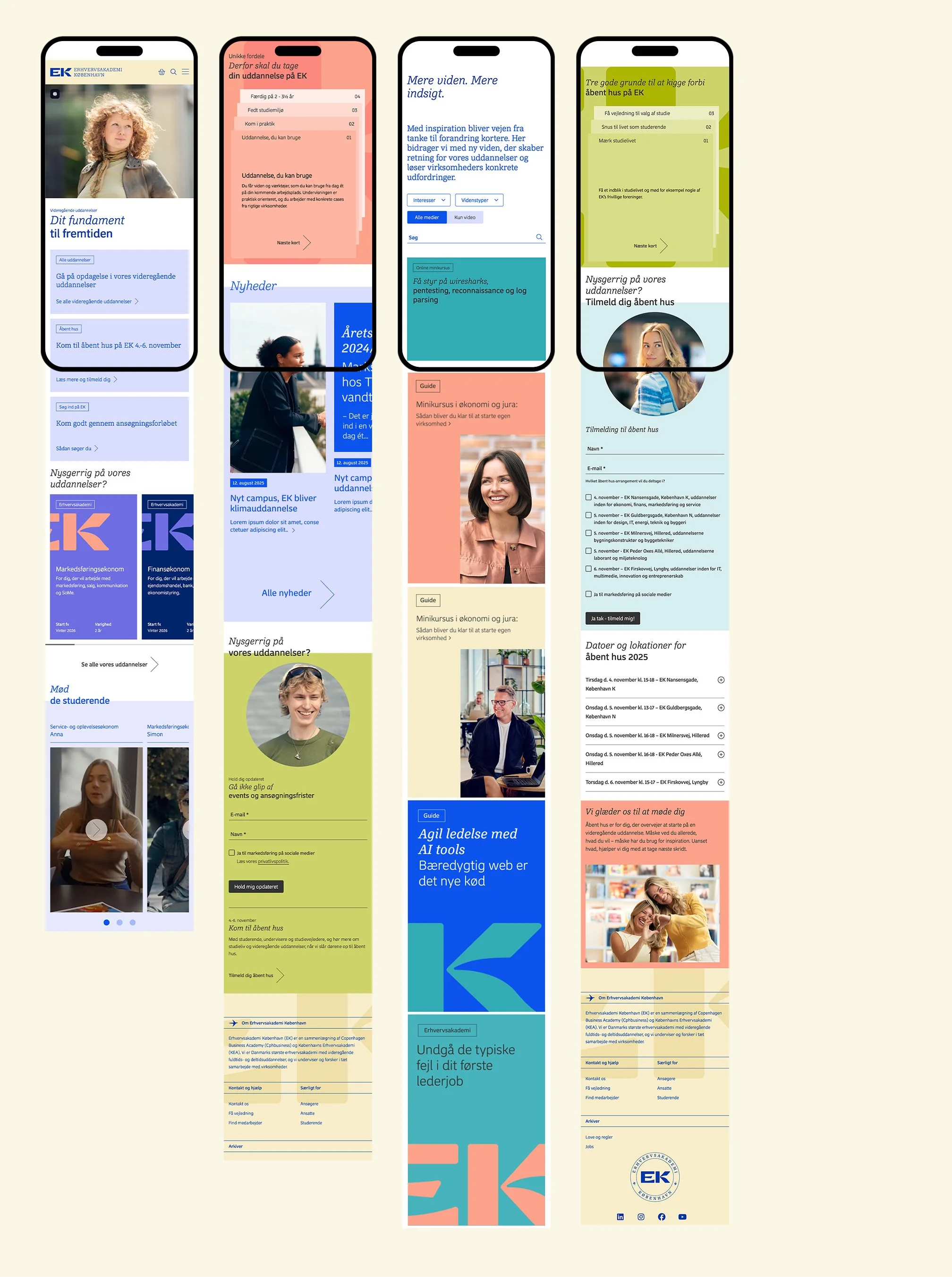
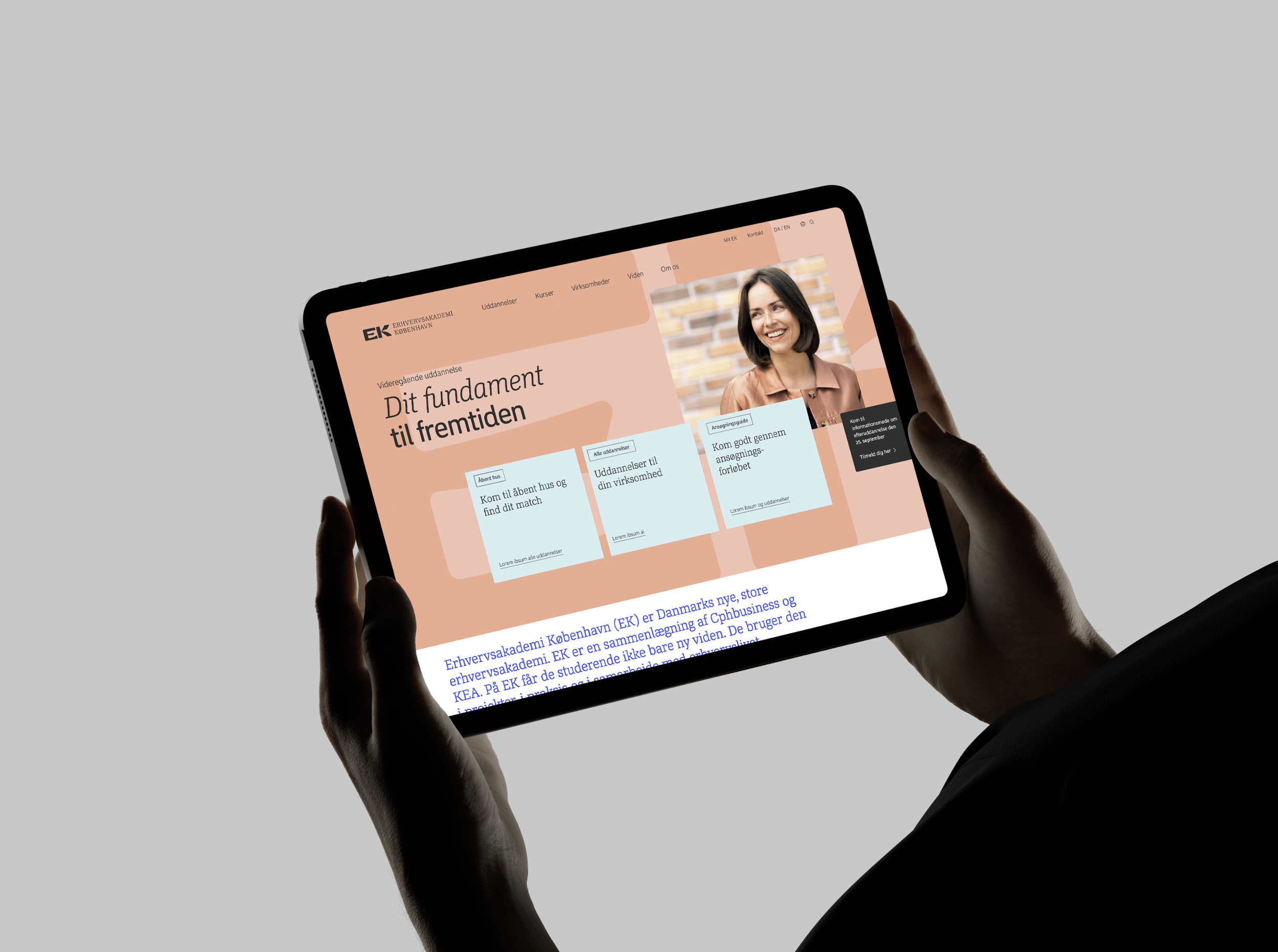
A smooth fusion of separate user journeys
When two websites fusion and both are information heavy, with individual UX and a variety of target groups, the design job becomes a matter of not only focusing on aesthetics but also help make user journeys even smoother.
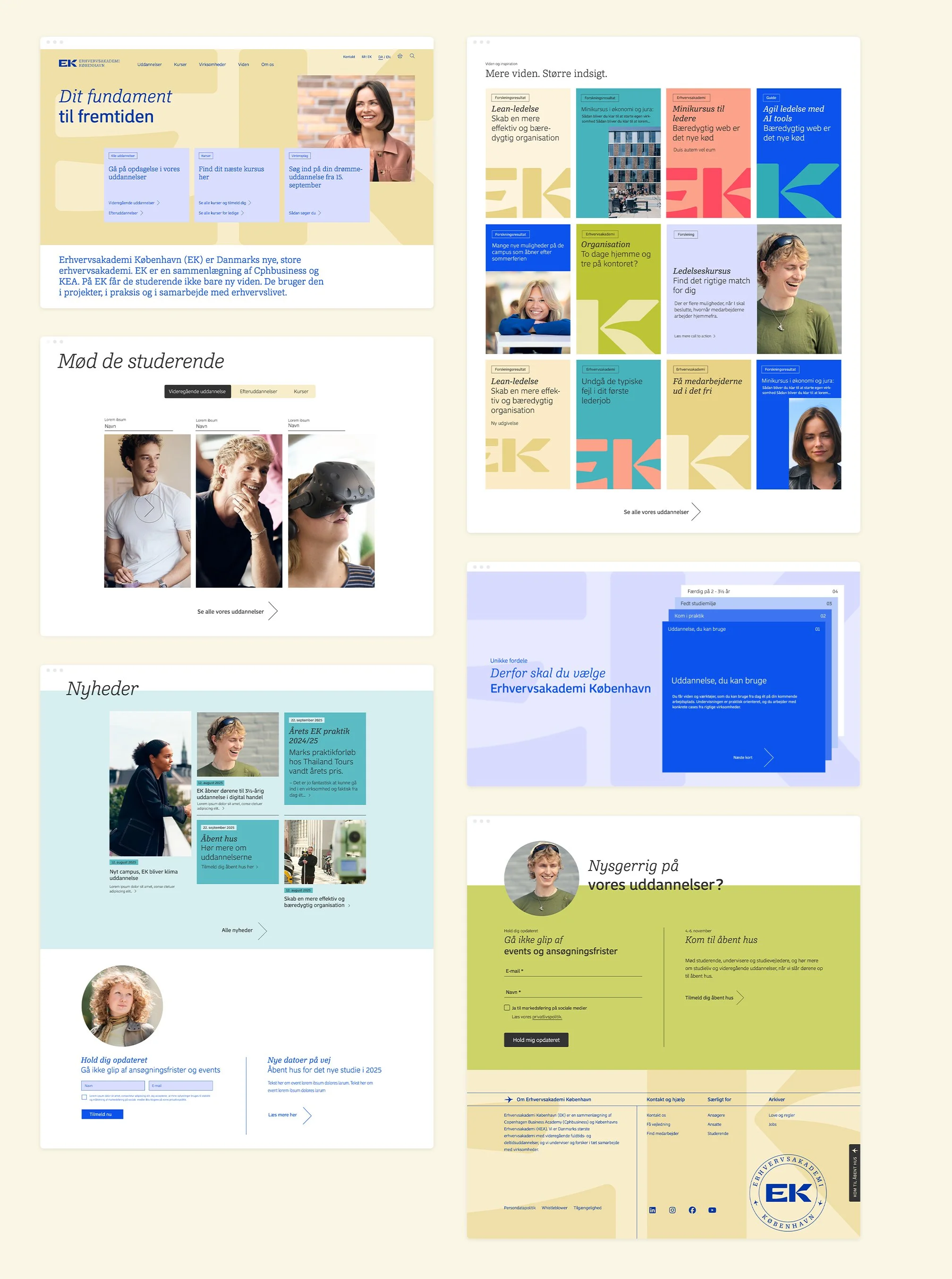
The design is rich with playful colours and animated elements making the content come alive.
We have carefully considered the versatile content, highlighting top prioritised news and guiding to more in-depth information as well as ensuring readability across all modules.
Rich & playful

Open and welcome
Across the site we introduce a new photography style for the academy by casting diverse students and faculty to capture an open and welcoming atmosphere.
We vary between high-impact branding portraits featuring strong personalities, artfully incorporating colours to match the brand and more soft on-location pictures from the real life at the academy.
RESULT
An identity that is both dynamic and trustworthy, while honouring the heritage of the founding institutions

WEBSITE: