
Godt Spisested
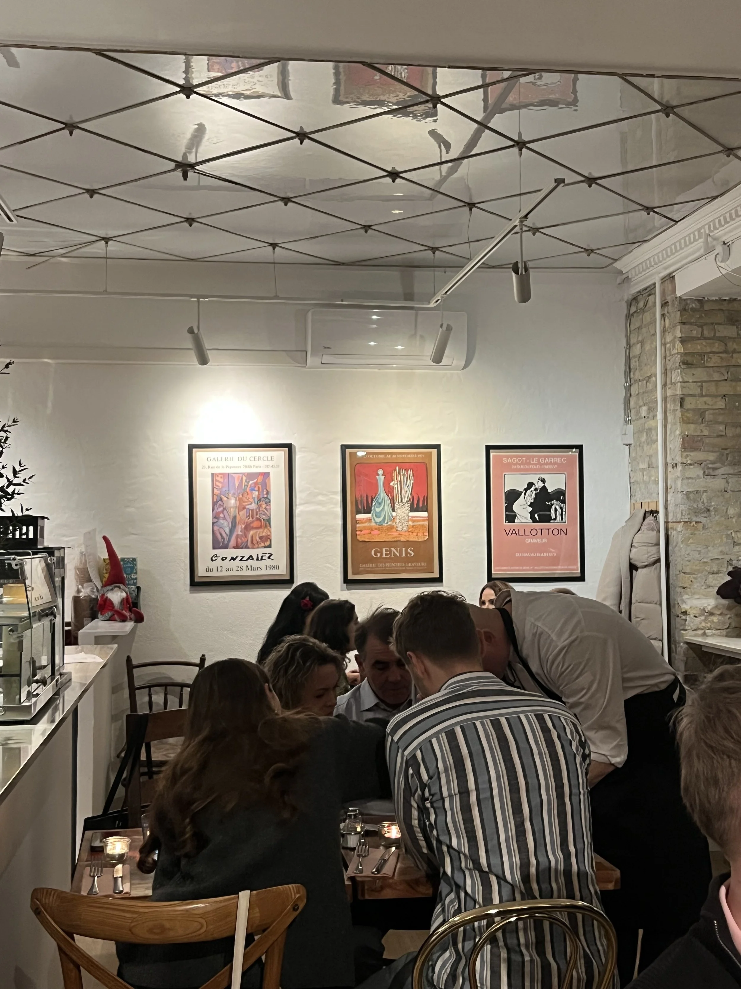
GODT is a new restaurant that launched in Copenhagen, November 2025. It is defined by its cozy, intimate atmosphere and a culinary approach rooted in passion and authenticity. The owner sought an unpretentious, personal expression that reflects the quality and care put into their offering.
We developed a logo along with a small visual identity package that encapsulates the restaurant’s DNA, combining genuine hospitality with a heartfelt cuisine.
The logo
The name GODT (meaning "good") is a simple promise of quality: A good place where you eat well. The owner envisioned a unique, personal expression characterised by soft, organic shapes.
The design subtly evokes the flow of a rich sauce being poured or the casual ring left by a good glass of wine. Pairing this with the more naive descriptor "Spisested" (Eatery) shaped like a little smile, ensures the identity remains approachable and unpretentious.
Colour variations
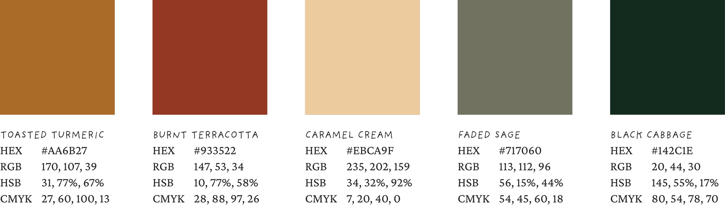
Colours
The colours were selected to evoke the restaurant's warmth and presence. We used earth tones and burnt hues to establish a "Nordic warmth" that reflects GODT's authentic, inviting atmosphere.

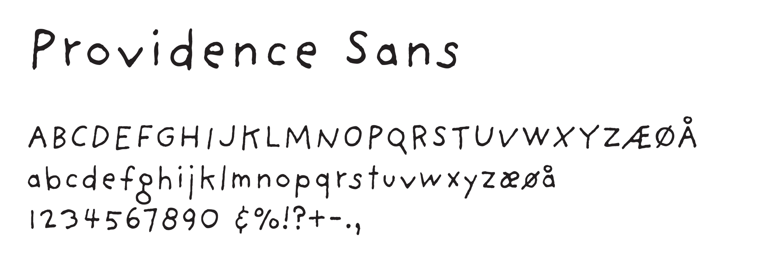
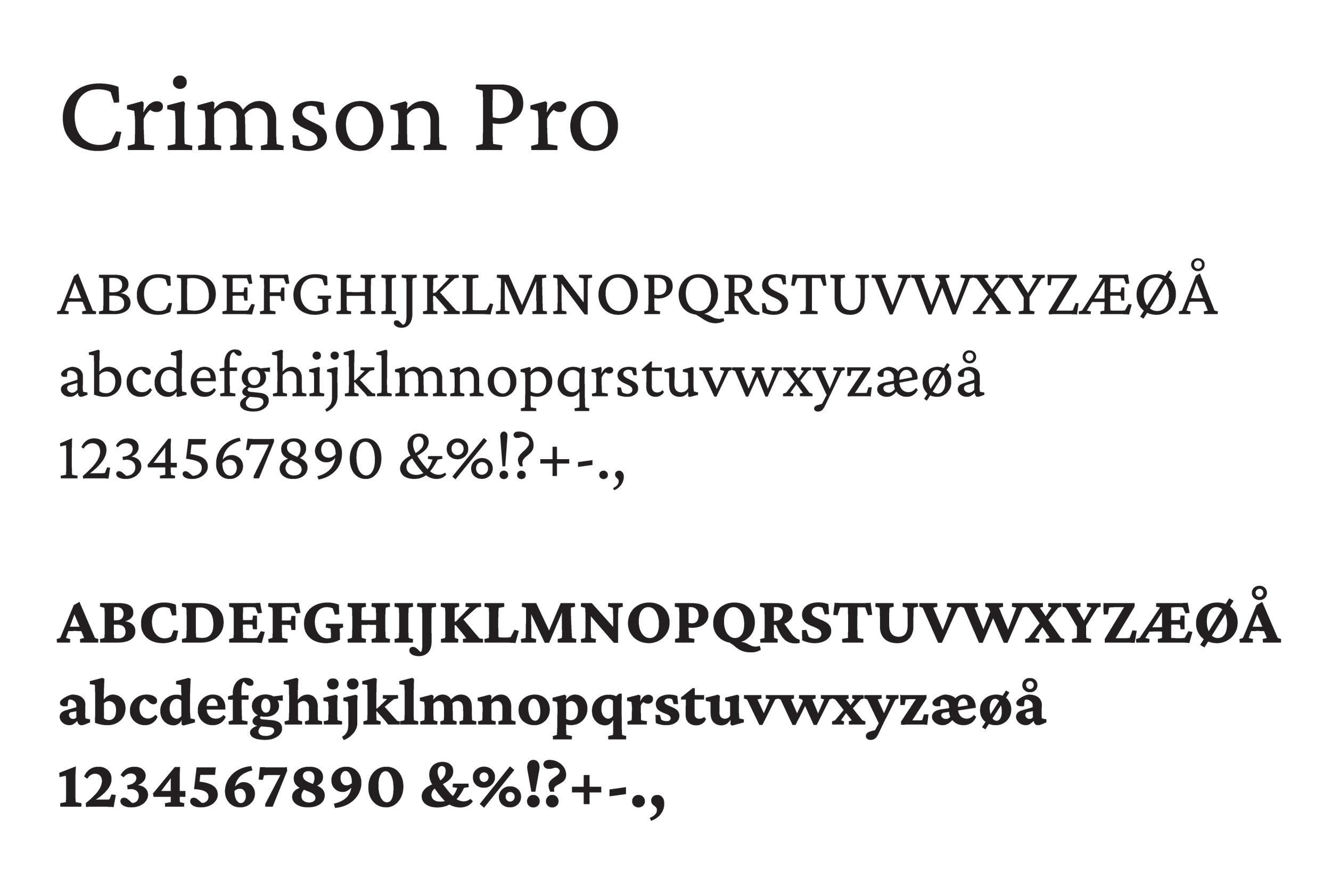
Typography
The typographies were chosen to balance a personal touch with a welcoming feel. We utilized Providence for headlines to mirror the handwritten character of the logo’s secondary typeface. For body copy, Crimson Pro was selected for its friendly quality and high readability.
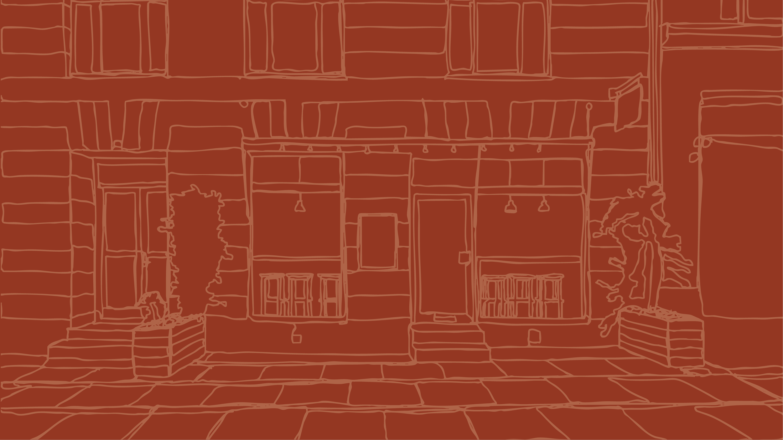
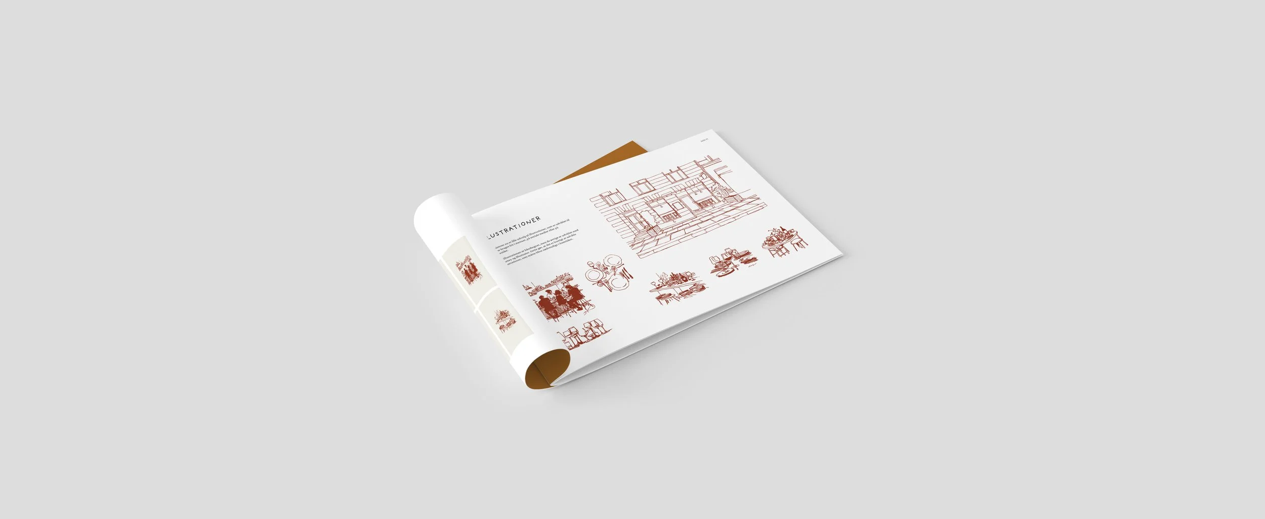
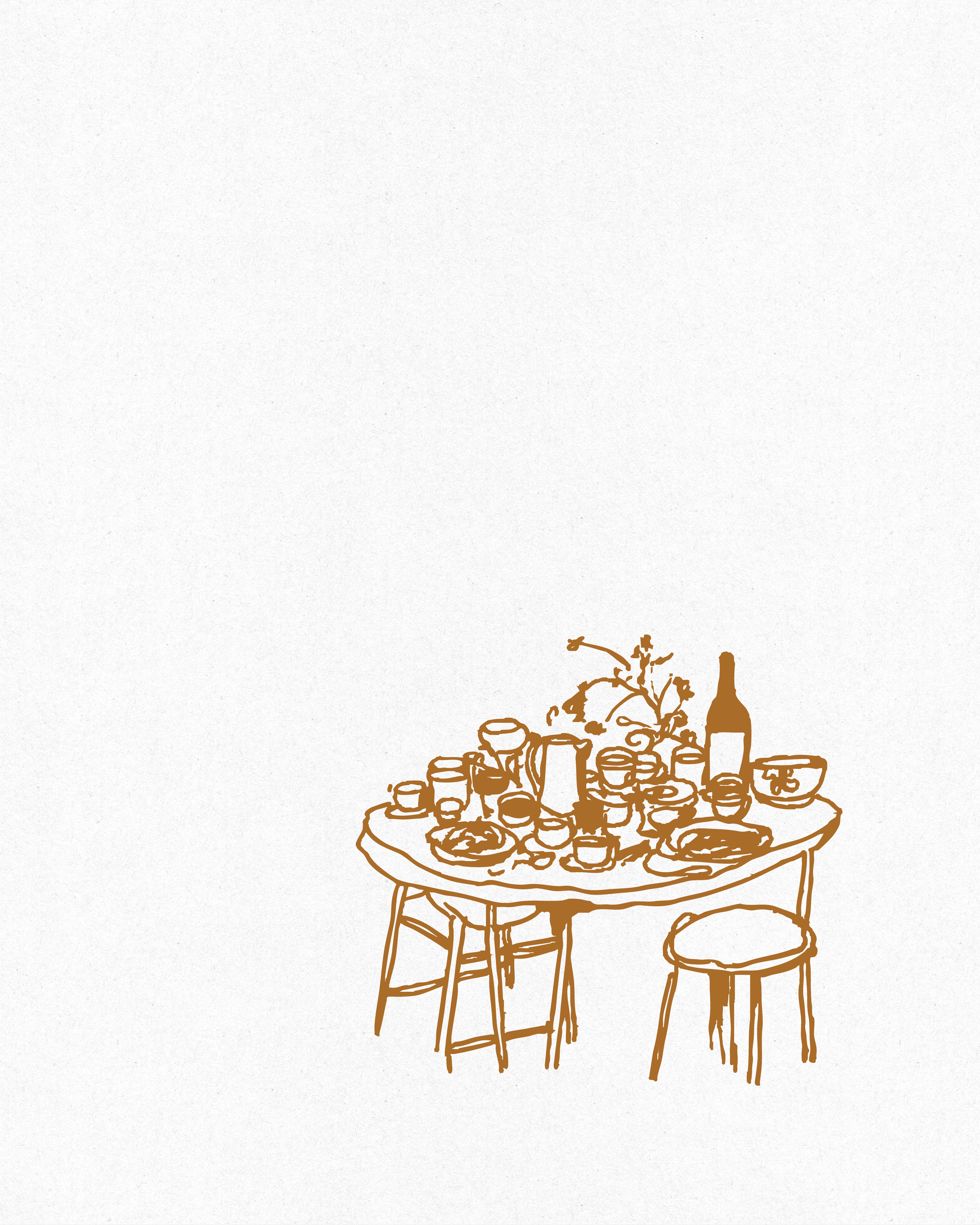
Illustrations
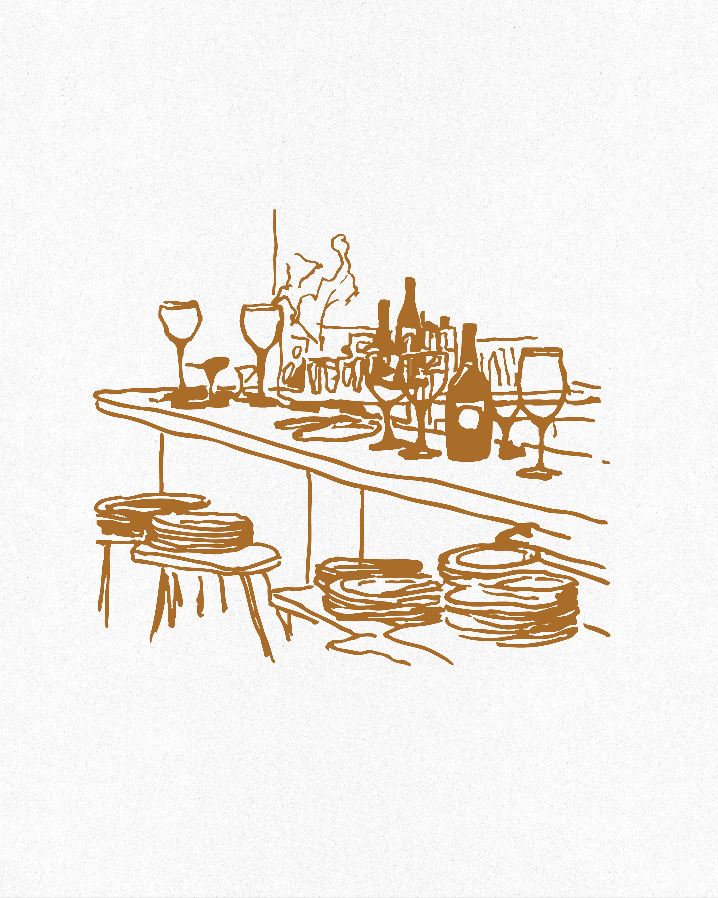
The illustrations can be used as little personal touch across menus, website, social media and street signs.
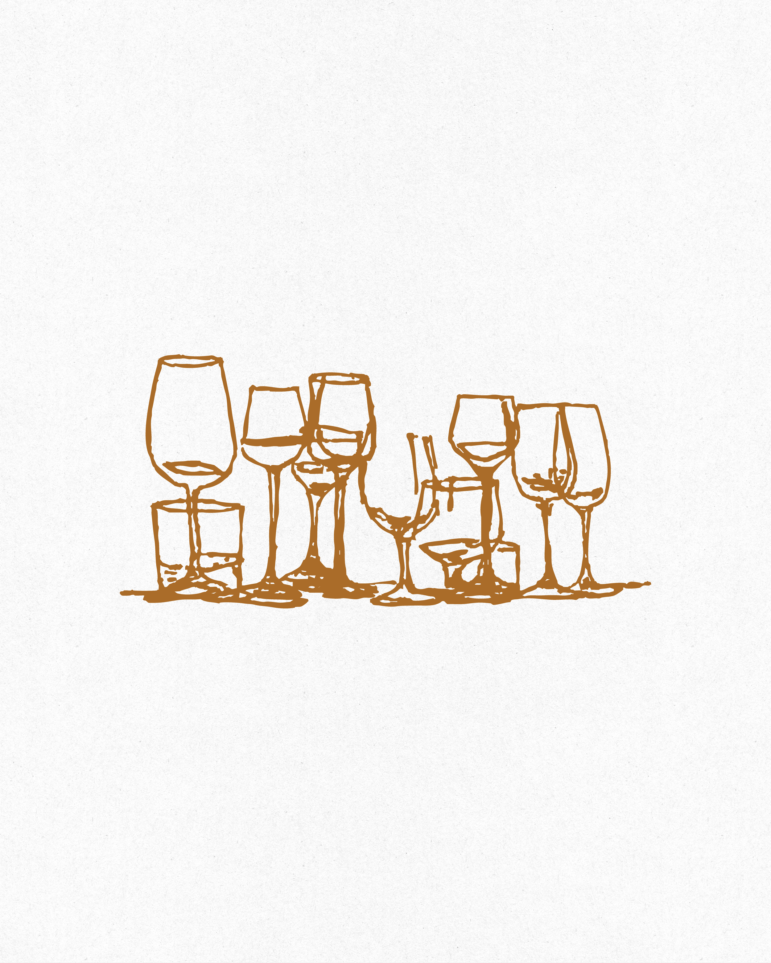
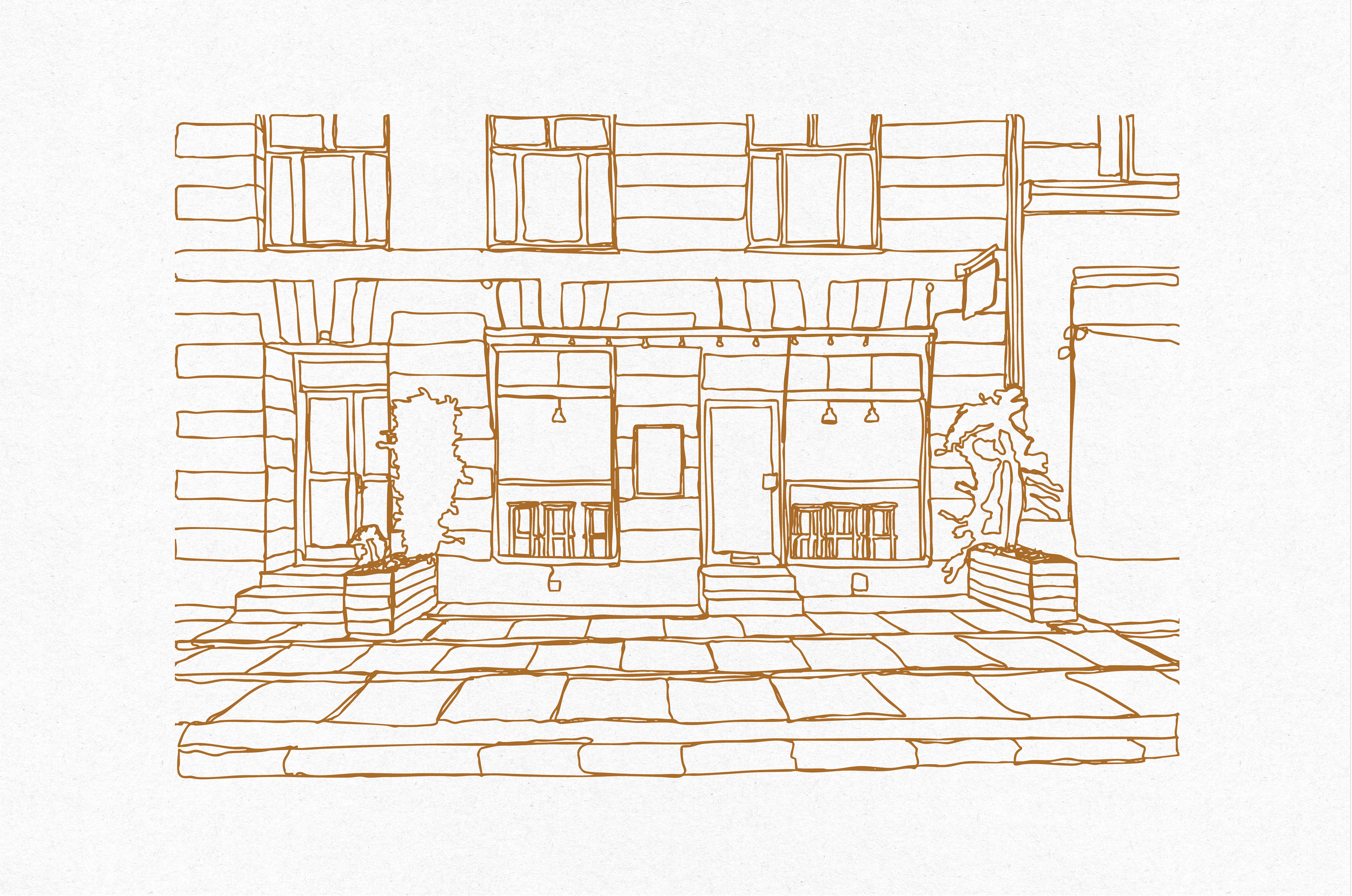
A hand-drawn illustration of the storefront adds a French touch to the Nordic setting, supported by a versatile library of icons developed for use across all brand platforms.
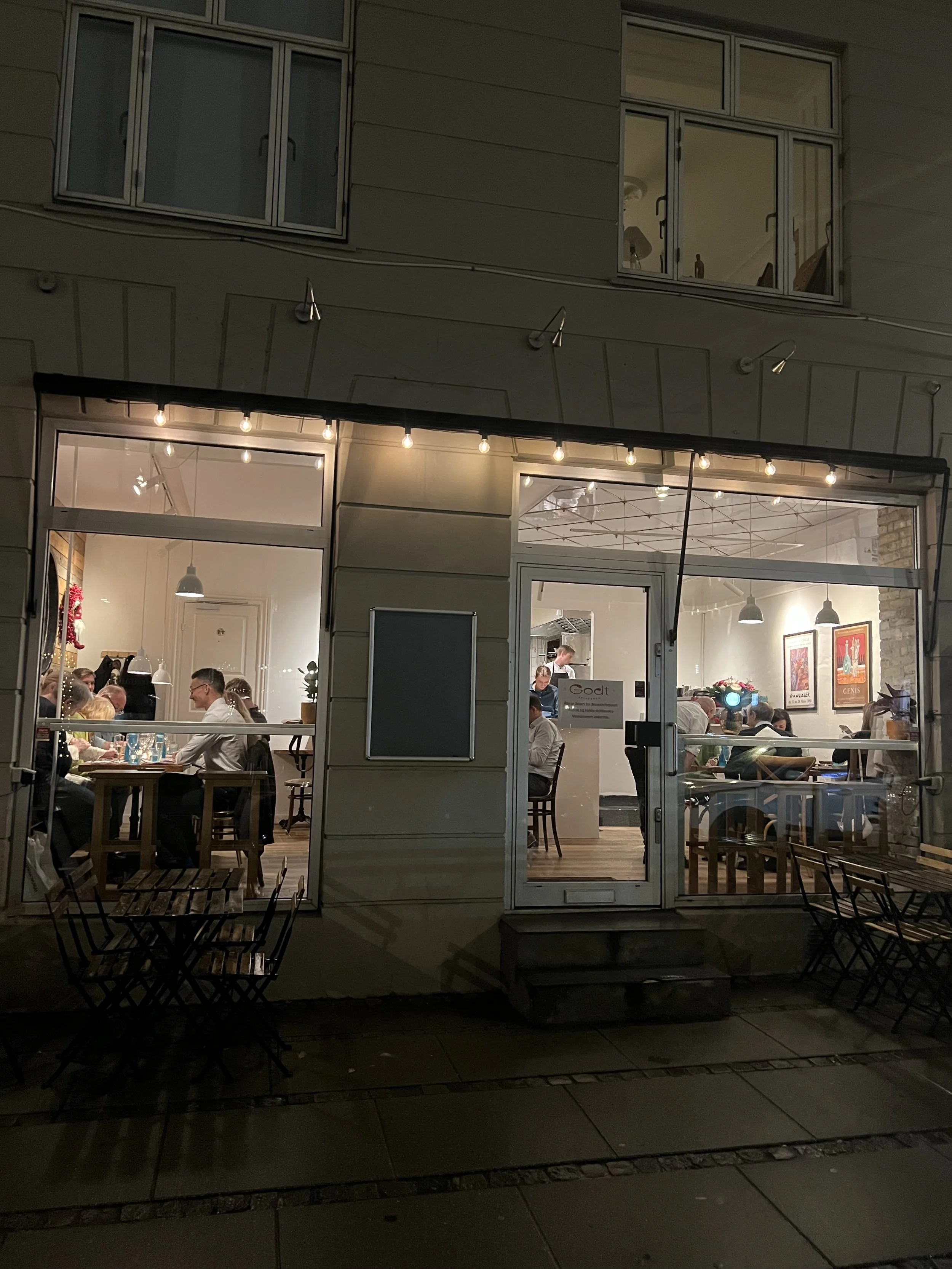
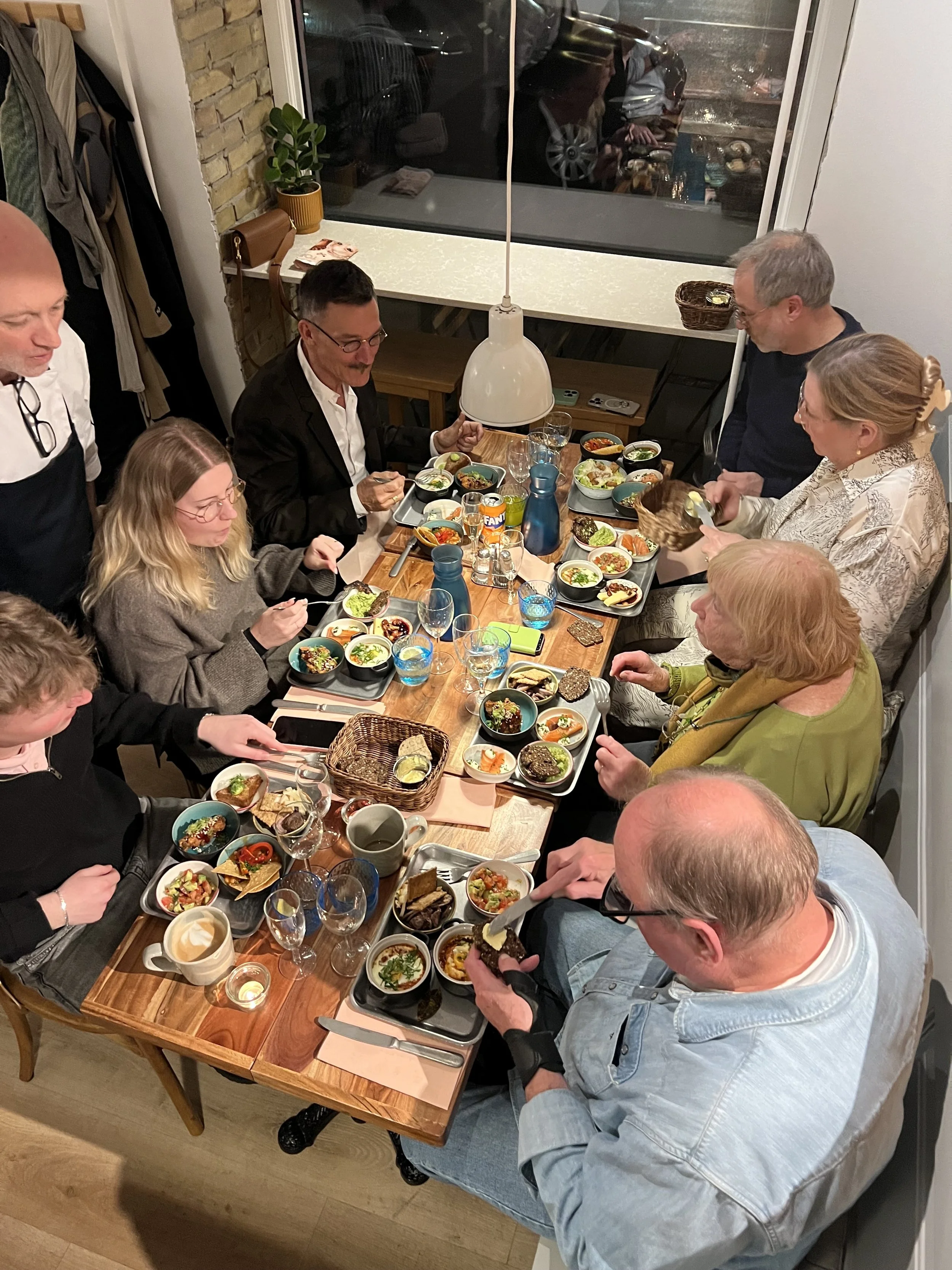
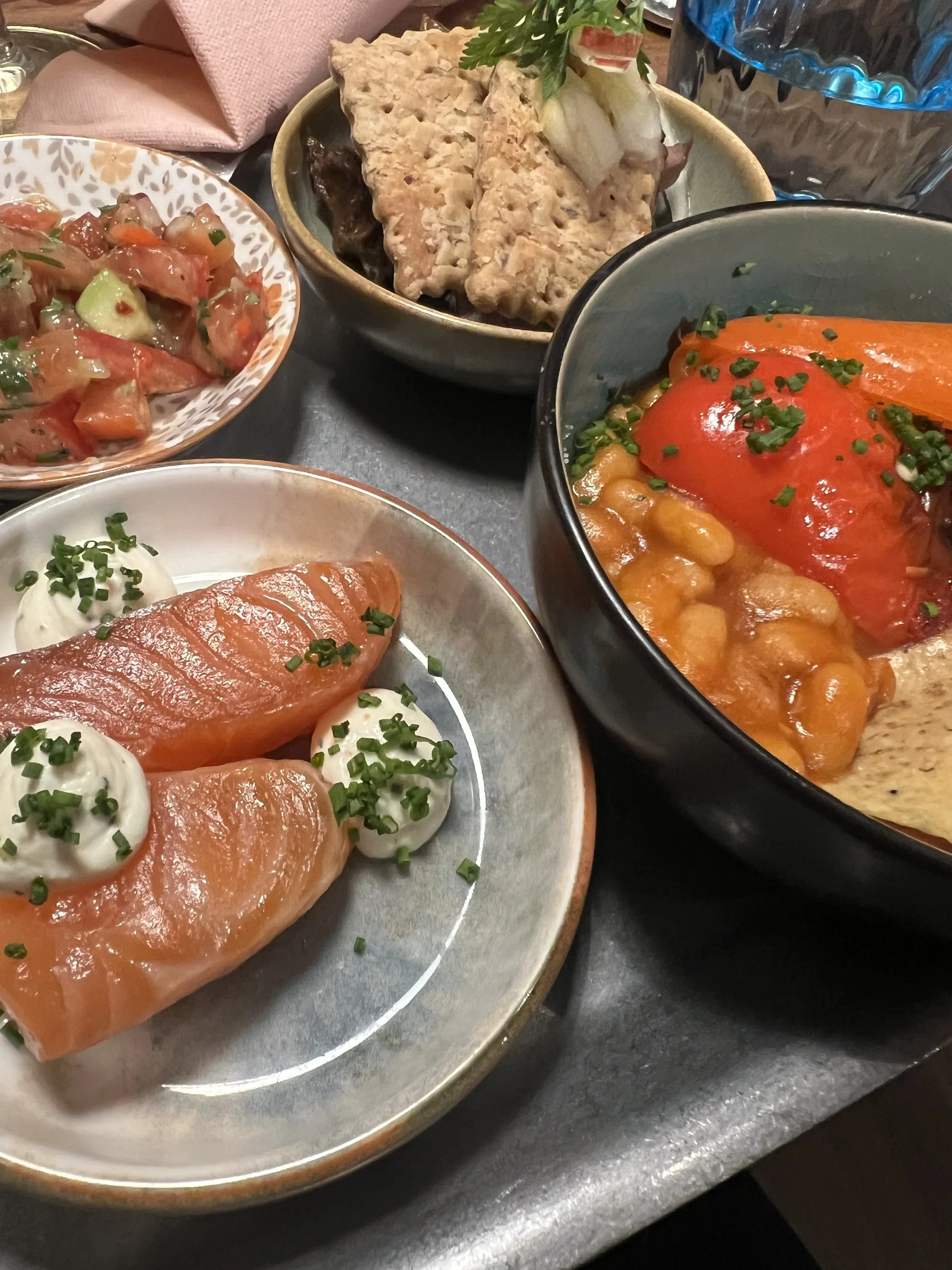
Photos: Private mobile snaps from guest