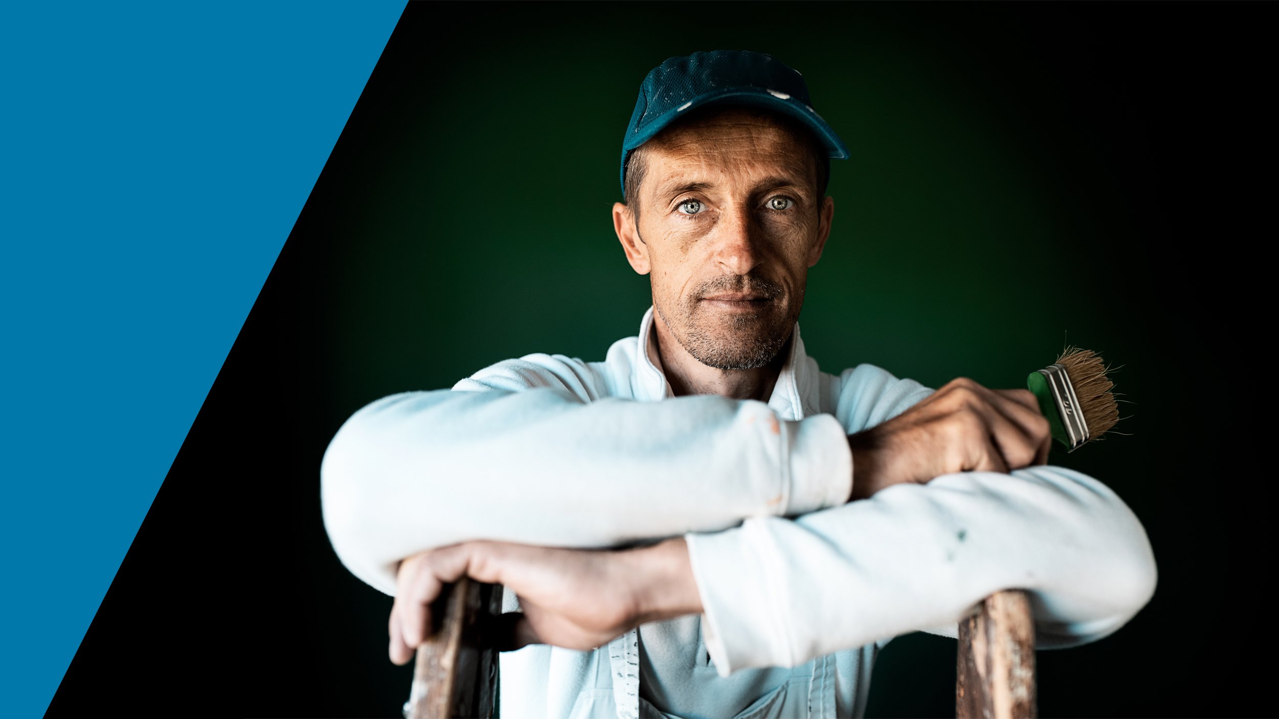
Bringing painters together
New local strategy
Business to business
To help PPG Denmark become Danish’ painters’ preferred destination through a new local brand strategy.
We helped birth an in-depth strategy in close collaboration with PPG, including everything from a new brand character, core narrative, and tone of voice to an alternative payoff that speaks directly to the target audience; professional painters.
Project
Client: PPG
Industry: Professional paint
Deliverables
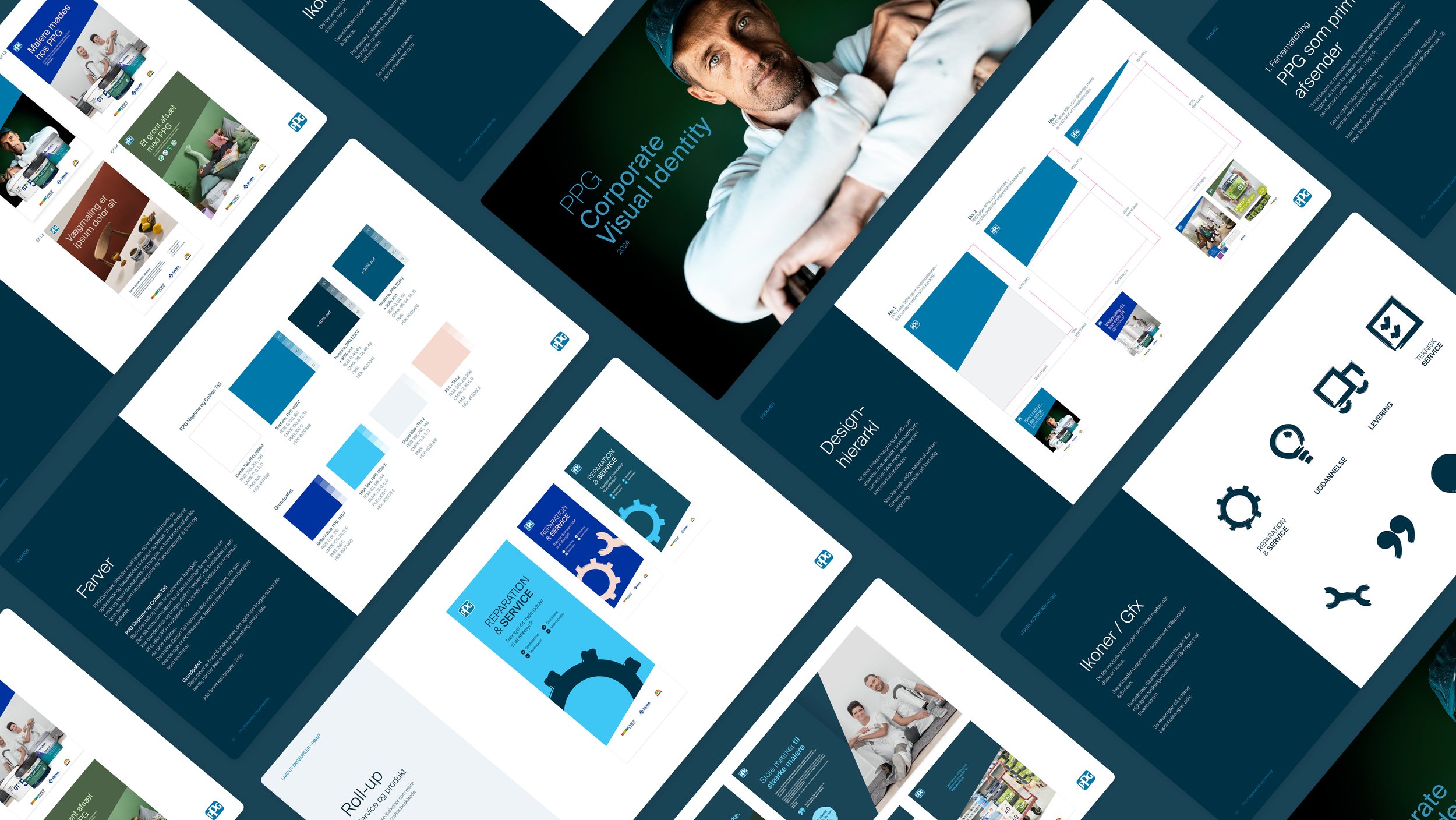
Brand strategy
Localised revitalised identity
Brandguide
New photos
New promise – new brand story
PPG already has a linguistic tagline based on a rational USP - that they have everything a professional painters need for their work, whether it’s quality products, professional expertise, or sustainable guidance, so they can rely on a single stop along their journey. This line is “Everything in one place”. We wanted to develop a tagline that captured the essence of what the above benefits really mean for the painters.
We want painters to think of PPG as a place where they have a meaningful conversation about what matters in their work, a meeting place that also works as a professional community, where painters can have a cup of coffee and exchange tips and experiences.

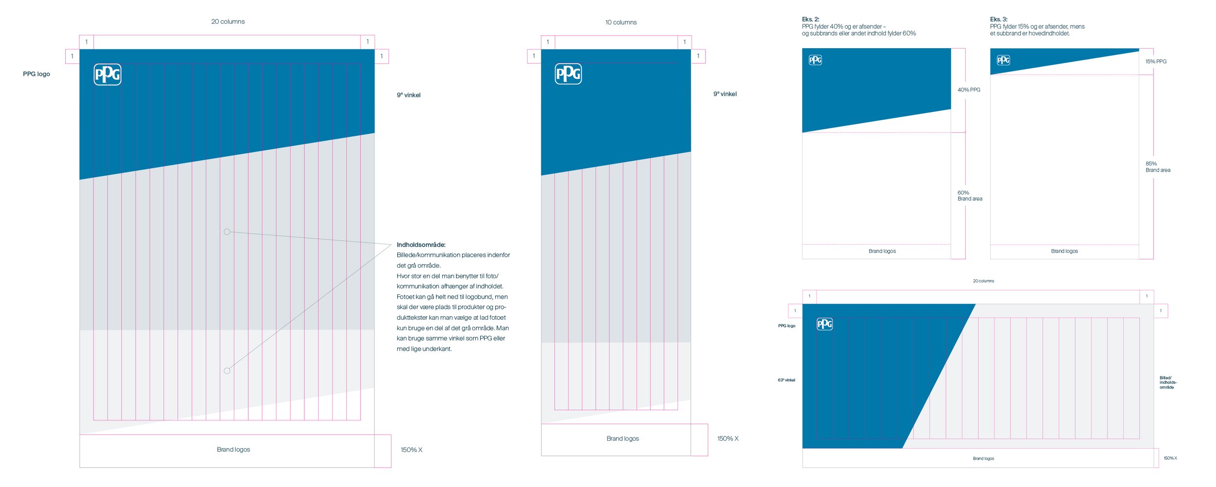
An updated universe for the Nordics

We took PPG’s comprehensive global CVI and simplified it for a Nordic target group. We narrowed down colours, elevated the famous PPG angle, and developed new graphic elements as well as a photographic style that resonates with the Danes and has a welcoming tonality.


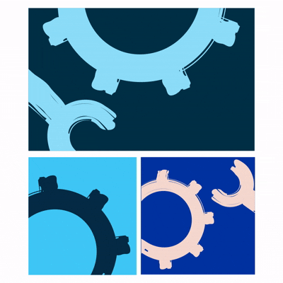
Painted iconography
Introducing paintbrush elements as both navigational icons and graphic branding elements.


A visual stretch
The PPG umbrella has several sub paint brands in its portfolio and as such we had to create a design hierarchy that gave room to each brand’s unique identity and messaging without over-shining the mother brand and took into consideration the official PPG corporate brand design guideline. We defined clear rules for the updated design concept and visualised the use of it on elements for all platforms and media. We tested the design on print ads, in-store materials, newsletters and display banners, as well as storefronts and vans.


A friendly tone
We gave the brand a new, friendly voice that is to the point and includes a light playfulness to create a connection with the target group. We defined rules for sparking curiosity in headlines, using a “we” and a “you”, bringing in a human touch as well as keeping copy simple.

