DYRUP
A breath of fresh air
Visual identity
DYRUP is an honored, Danish paint & varnish brand with more than 100 years in the market. We developed a new contemporary visual identity, reflecting both a modern brand and its historic DNA. We supported and enriched the brand’s promise to continuously inspire Danes with trending colours and bold DIY.
Less is more
We changed the iconic logo from a 3D to a 2D style and gave it a more simple and clean look while still preserving it’s DNA
A stamp of quality
We developed a stamp illustration with the pay-off and the year of establishment to highlight the long, proud history of Dyrup. To cement their expertise in the field and to raise a sense of security with the consumer. We know what we talk about, when we talk about paint!


A brand new Brandguide
Through a meticulous brand guide we defined strategic rules for all visual components, from font types and colours, to new graphic stamp proof and photographs for DYRUP to have a hands-on, tangible toolbox for everyday marketing and branding purposes.


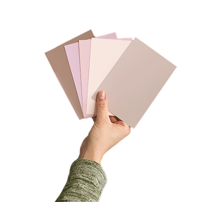
Photographic universe
The photographic style of a paint brand is vital, as it is in the imagery the product comes to life.
We developed a visual approach to content that added a stylish, yet honest realism to the brand.


Playing with engaging animations and ensuring a believable environment for social media followers to engage...

Seasonal Campaigns
Campaigns for Dyrup’s Social Media channels.
With product names such as Reindeer, Christmas Ivy and At The Beach we just had to dip the seasons in this beautiful paint.
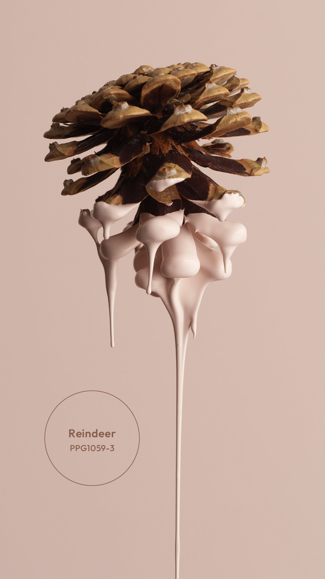
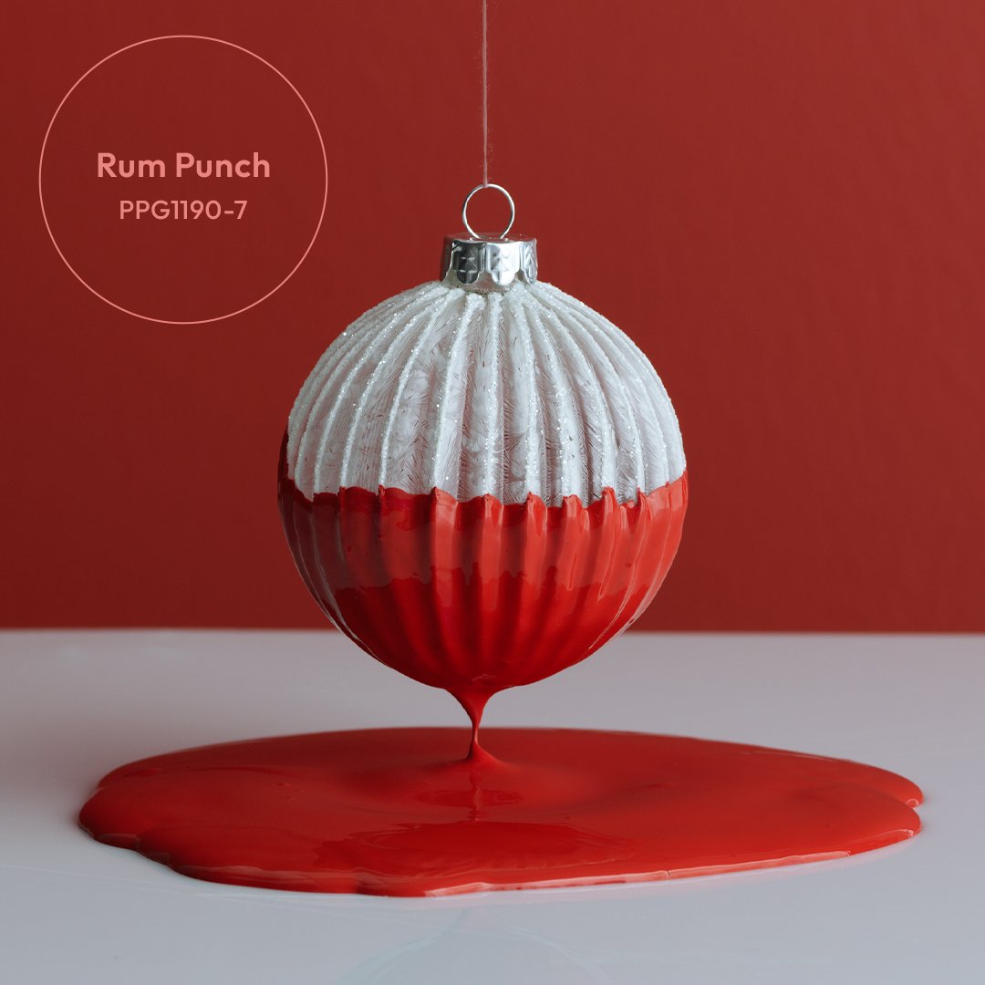
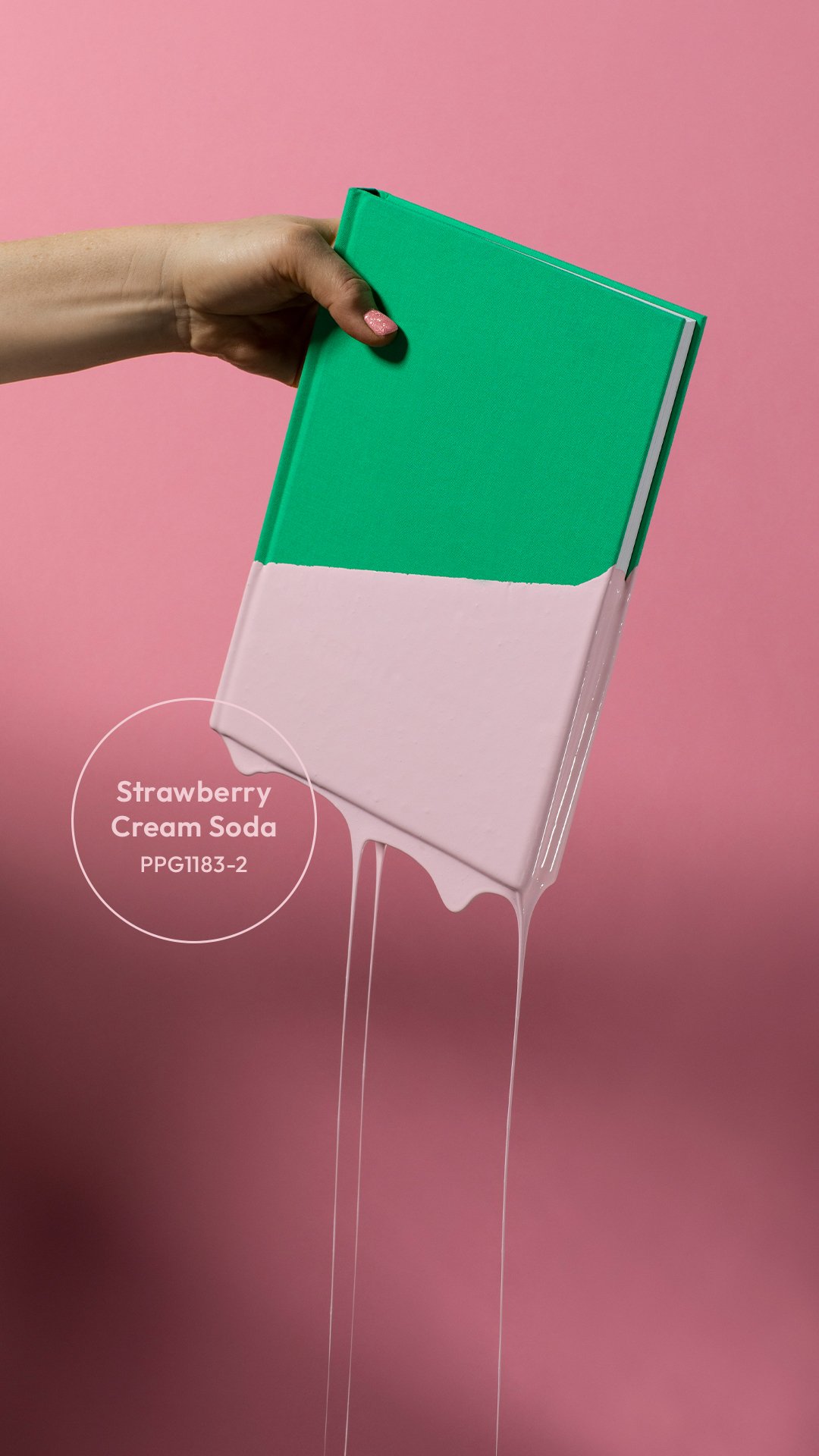
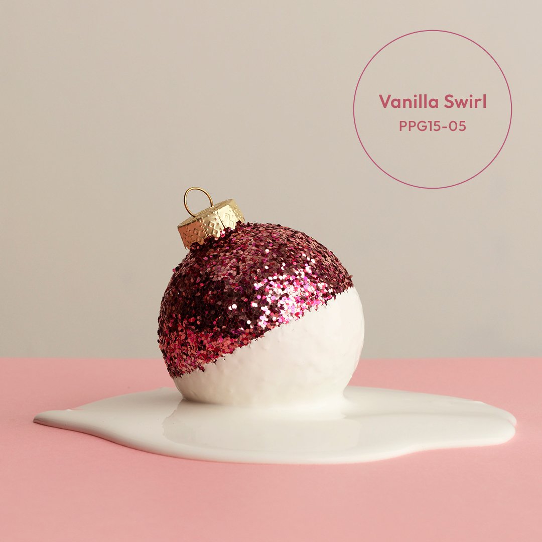
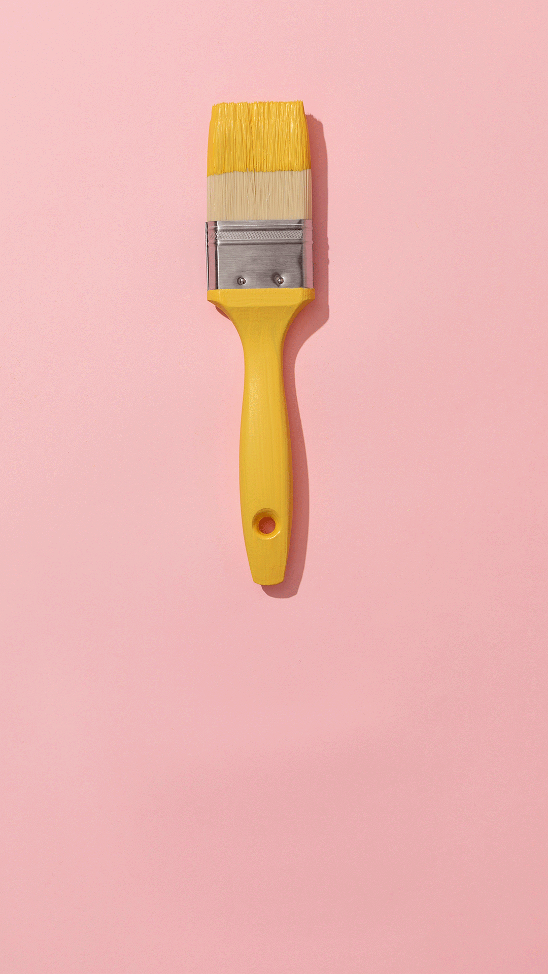
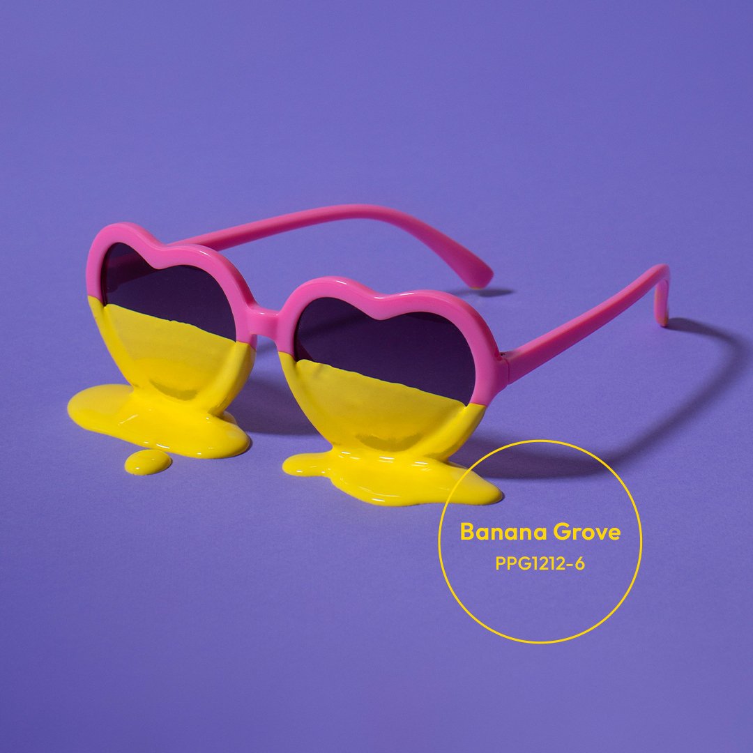
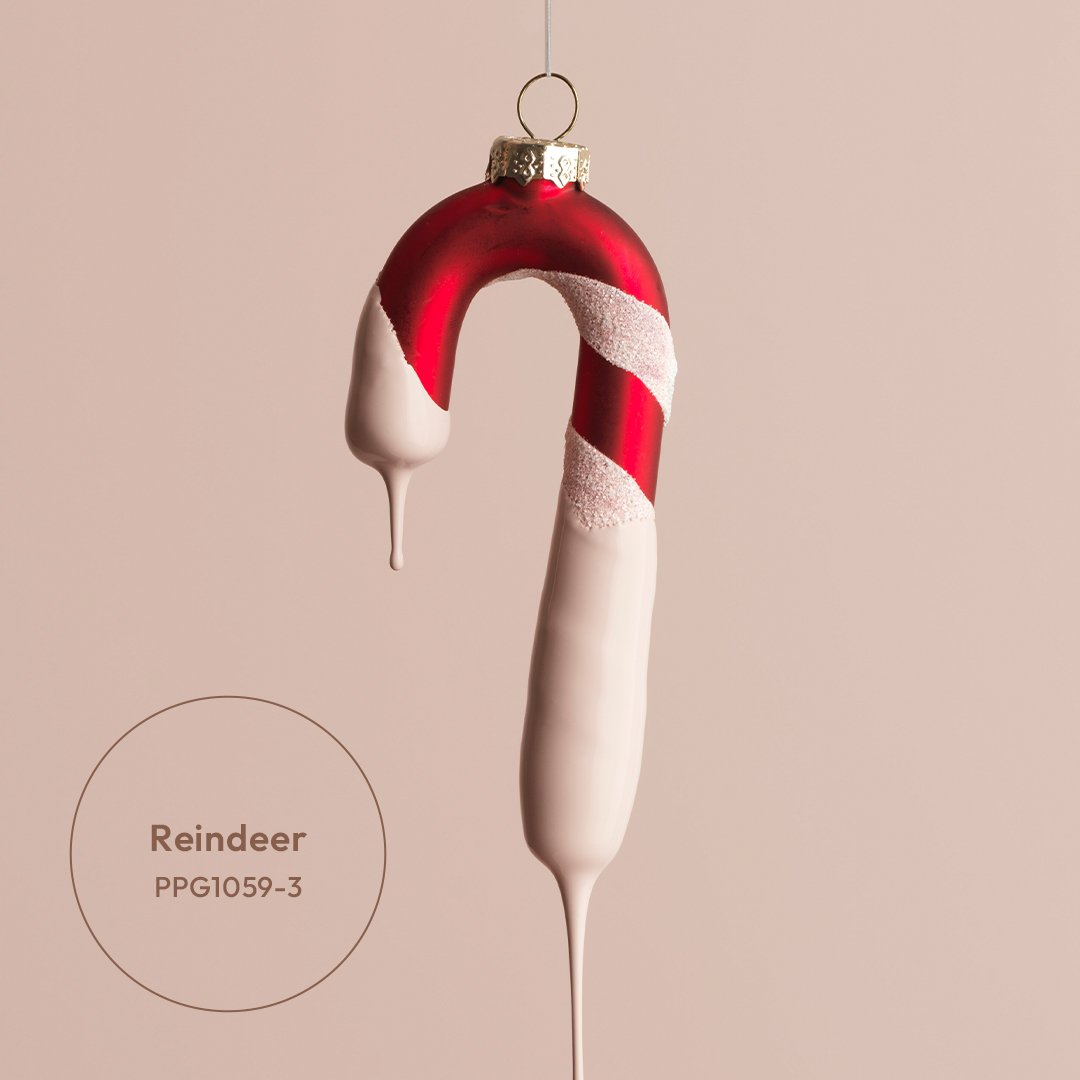
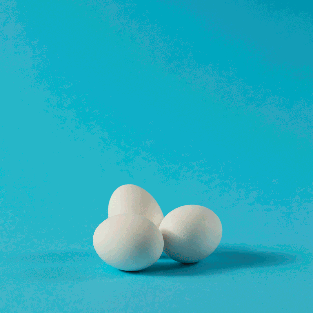

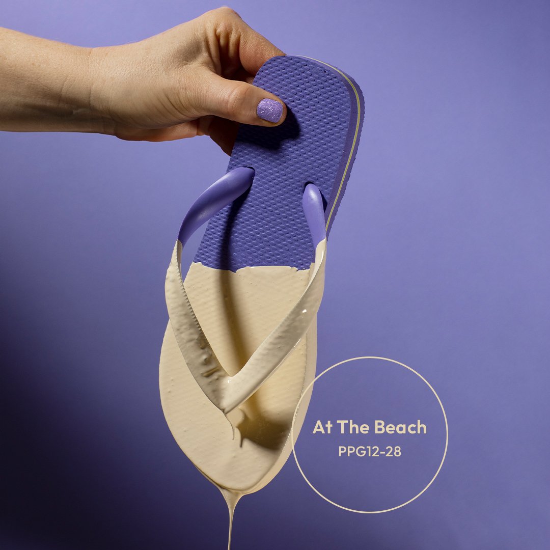
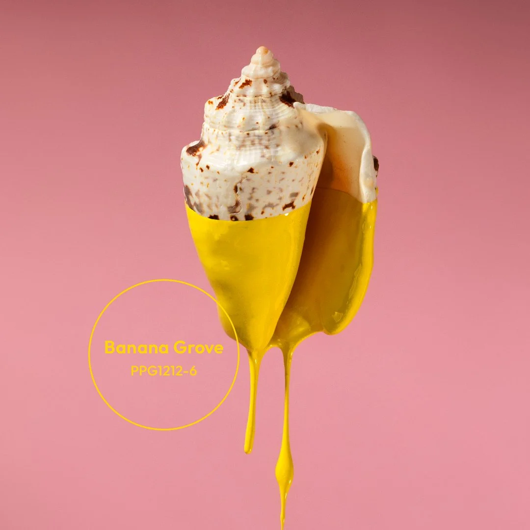
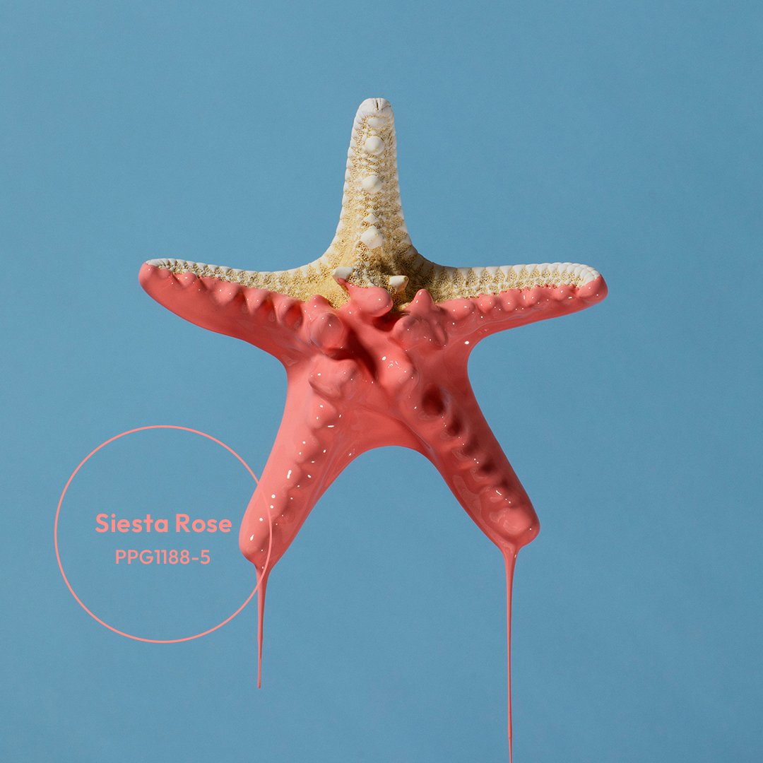
Photo: HVIIDPHOTOGRAPHY
